List items
Items from the current list are shown below.
Waste
19 Nov 2019 : Graphs of Waste, Part 2: A Continuous Histogram Approach #
In part one we looked at how graphs can be a great tool for expressing the generalities in specific datasets, but how even seemingly minor changes in the choice of graphing technique can result in a graph that tells an inaccurate story.
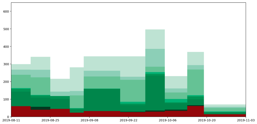
We finished by looking at how a histogram would be a good choice for representing the particular type of data I've been collecting, to express the quantity of various types of waste (measured by weight) as the area under the graph. Here's the example data plotted as a histogram.
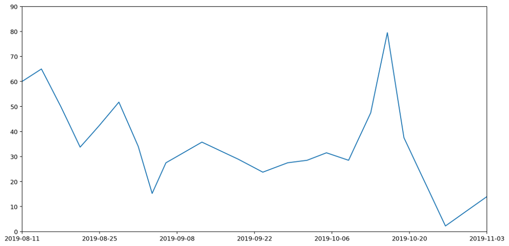
While this is good at presenting the general picture, I really want to also express how my waste generation is part of a continuous process. In the very first graph I generated to try to understand my waste output, I drew the datapoints and joined them with lines. This wasn't totally crazy as it highlighted the trends over time. However, it gave completely the wrong impression because the area under the graph bore no relation to the amount of waste I produced.
How can we achieve both? Show a continuous change of the data by joining datapoints with lines, while also ensuring the area under the graph represents the actual amount of waste produced?
The histogram above achieves the goal of having the area under the graph represent the all-important quantities captured by the data clearly visible in the graph. But it doesn't express the continuous nature of the data.
Contrariwise, if we were to take the point at the top of each histogram column and join them up, we'd have a continuous line across the graph, but the area underneath would no longer represent useful data.
If we want to capture a `middle ground' between the two, it's helpful to apply some additional constraints.
To do this, we'll adjust the position of the datapoints for each of the readings and introduce a new point in between every pair of existing datapoints as follows.
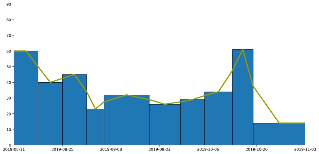
Following these rules we end up with something like this.
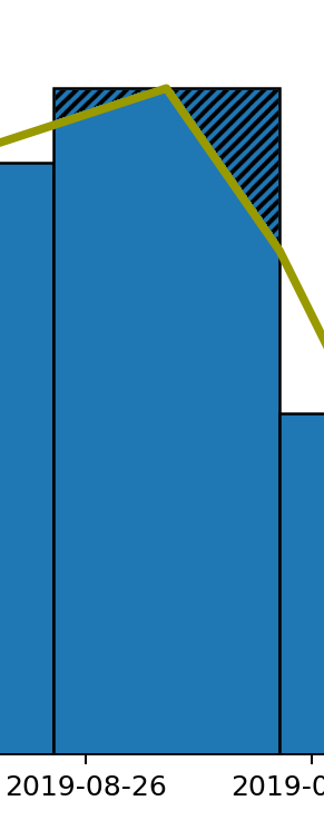
This gives us our continuous line, but as you can see from the diagram, for each column the area under the line doesn't necessarily represent the quantity captured by the data. We can see this more easily by focussing in on one of the columns. The hatched area in the picture below shows area that used to be included, but which would be removed if we drew our line like this, making the area under the line for this particular region less than it should be.
Across the entire width of these graphs the additions might cancel out the subtractions, but that's not guaranteed, and it also fails our second requirement that the area under the line should be the same as the area under the histogram column for each column individually.
To address this we can adjust the position of the point in the centre of each column by altering its height to capture the correct amount of area. In the case shown above, we'd need to move the point higher because we've cut off some of the area and need to get it back. In other cases we may need to reduce the height of the point to remove area that we over-captured.
To calculate the exact height of the central point, we can use the following formula.
$$ y = 2h - \frac{1}{2} (y_1 + y_2) .
$$
The area $A = A_1 + A_2 + A_3 + A_4$ under the curve can then be calculated as follows.
\begin{align*} A & = \left( \frac{w}{2} \times y_1 \right) + \left( \frac{w}{2} \times y_2 \right) + \left( \frac{1}{2} \times \frac{w}{2} \times (y - y_1) \right) + \left( \frac{1}{2} \times \frac{w}{2} \times (y - y_3) \right) \\ & = \frac{w}{2} \left( \frac{1}{2} y_1 + \frac{1}{2} y_2 + y \right) . \\ \end{align*}
Substituting $y$ into this we get the following.
\begin{align*} A & = \frac{w}{2} \left( \frac{1}{2} y_1 + \frac{1}{2} y_2 + 2h - \frac{1}{2} y_1 - \frac{1}{2} y_2 \right) \\ & = wh. \end{align*}
Which is the area of the column as required.
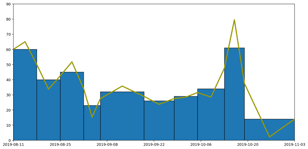
Following this approach we end up with a graph like this.
Which taken on its own gives a clear idea of the trend over time, while still capturing the overall quantity of waste produced in each period as the area under the graph.
In the next part we'll look at how we can refine this further by rendering a smooth curve, rather than straight lines, but in a way that retains the same properties we've been requiring here.
All of the graphs here were produced using the superb MatPlotLib and the equations rendered using MathJax (the first time I'm using it, and it looks like it's done a decent job).
We finished by looking at how a histogram would be a good choice for representing the particular type of data I've been collecting, to express the quantity of various types of waste (measured by weight) as the area under the graph. Here's the example data plotted as a histogram.
While this is good at presenting the general picture, I really want to also express how my waste generation is part of a continuous process. In the very first graph I generated to try to understand my waste output, I drew the datapoints and joined them with lines. This wasn't totally crazy as it highlighted the trends over time. However, it gave completely the wrong impression because the area under the graph bore no relation to the amount of waste I produced.
How can we achieve both? Show a continuous change of the data by joining datapoints with lines, while also ensuring the area under the graph represents the actual amount of waste produced?
The histogram above achieves the goal of having the area under the graph represent the all-important quantities captured by the data clearly visible in the graph. But it doesn't express the continuous nature of the data.
Contrariwise, if we were to take the point at the top of each histogram column and join them up, we'd have a continuous line across the graph, but the area underneath would no longer represent useful data.
If we want to capture a `middle ground' between the two, it's helpful to apply some additional constraints.
- The line representing the weights should be continuous.
- The area under the line should be the same as the area under the histogram column for each column individually.
- For each reading, the line can be affected by the readings either side (this is inevitable if the constraint 1 is going to be enforced), but should be independent of anything further away.
To do this, we'll adjust the position of the datapoints for each of the readings and introduce a new point in between every pair of existing datapoints as follows.
- Start with the datapoints positioned to be horizontally centred in each column and taken as the height of the histogram column that encloses it.
- For every pair of datapoints A and B, place an additional point at the boundary of the columns for A and B, and with y value set as the average between the two columns A and B.
Following these rules we end up with something like this.
This gives us our continuous line, but as you can see from the diagram, for each column the area under the line doesn't necessarily represent the quantity captured by the data. We can see this more easily by focussing in on one of the columns. The hatched area in the picture below shows area that used to be included, but which would be removed if we drew our line like this, making the area under the line for this particular region less than it should be.
Across the entire width of these graphs the additions might cancel out the subtractions, but that's not guaranteed, and it also fails our second requirement that the area under the line should be the same as the area under the histogram column for each column individually.
To address this we can adjust the position of the point in the centre of each column by altering its height to capture the correct amount of area. In the case shown above, we'd need to move the point higher because we've cut off some of the area and need to get it back. In other cases we may need to reduce the height of the point to remove area that we over-captured.
To calculate the exact height of the central point, we can use the following formula.
$$ y = 2h - \frac{1}{2} (y_1 + y_2) .
$$
The area $A = A_1 + A_2 + A_3 + A_4$ under the curve can then be calculated as follows.
\begin{align*} A & = \left( \frac{w}{2} \times y_1 \right) + \left( \frac{w}{2} \times y_2 \right) + \left( \frac{1}{2} \times \frac{w}{2} \times (y - y_1) \right) + \left( \frac{1}{2} \times \frac{w}{2} \times (y - y_3) \right) \\ & = \frac{w}{2} \left( \frac{1}{2} y_1 + \frac{1}{2} y_2 + y \right) . \\ \end{align*}
Substituting $y$ into this we get the following.
\begin{align*} A & = \frac{w}{2} \left( \frac{1}{2} y_1 + \frac{1}{2} y_2 + 2h - \frac{1}{2} y_1 - \frac{1}{2} y_2 \right) \\ & = wh. \end{align*}
Which is the area of the column as required.
Following this approach we end up with a graph like this.
Which taken on its own gives a clear idea of the trend over time, while still capturing the overall quantity of waste produced in each period as the area under the graph.
In the next part we'll look at how we can refine this further by rendering a smooth curve, rather than straight lines, but in a way that retains the same properties we've been requiring here.
All of the graphs here were produced using the superb MatPlotLib and the equations rendered using MathJax (the first time I'm using it, and it looks like it's done a decent job).


Comments
Uncover Disqus comments