List items
Items from the current list are shown below.
Blog
3 Dec 2019 : Graphs of Waste, Part 4: Pitfalls and Scope for Improvement #
In the previous three articles (part 1, part 2 and part 3) we developed the idea of a histogram into a histocurve, a graph that displays data that might otherwise be presented as a histogram, but which better captures the continuity between data items by presenting them as a curve, rather than a series of columns.
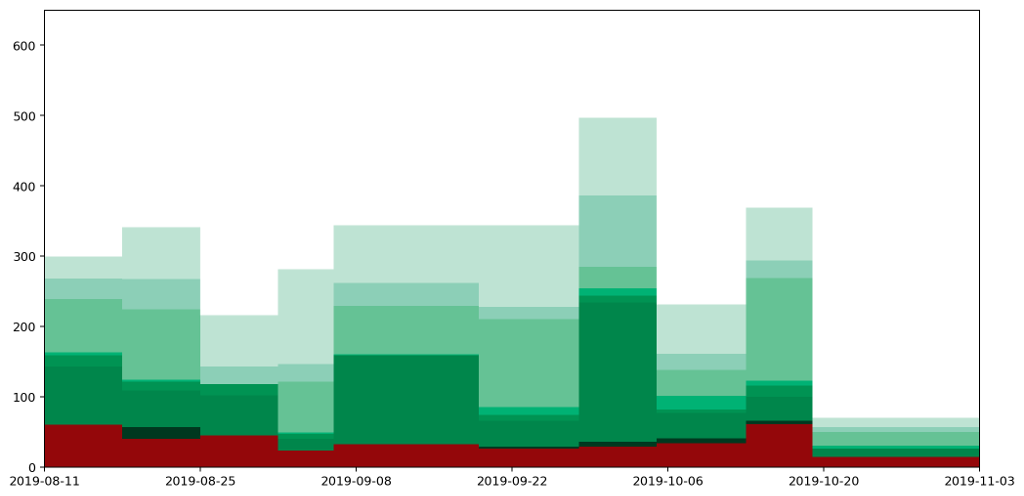
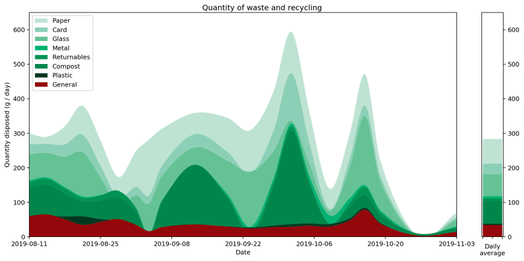
Here are a couple of graphs that show the same data plotted as a histogram and then as a histocurve. You may recall that our starting point was a realisation that simply plotting the data and joining the points gave a misleading representation of the data. The important point about these two graphs — both the histogram and the histocurve — is that the area under the graph is always a good representation of the actual quantities the data represents. In this case, it's how much recycling and rubbish I generate each day.
Having got to this point, we can see that there are also some pitfalls with using these histocurves that don't apply to histograms. I reckon it's important to be aware of them, so worth spending a bit of time considering them.
The most obvious to me is the fact that the histocurve doesn't respect the maximum or minimum bounds of the graph. In the case of my waste data, there's a very clear minimum floor because it's impossible for me to generate negative waste.
In spite of this, because the height is higher at some points than it would otherwise be as a means of maintaining continuity, it has to be lower at other points to compensate. As a result in several areas the height dips below the zero point. We can see this in the stacked curve as areas where the curve gets 'cut off' by the curve below it.
As yet, I've not been able to think of a sensible way to address this. Fixing it would require compensating for overflow in some areas by distributing the excess across other columns. This reduces accuracy and increases complexity. It's also not clear that an approach like this could always work. If you have any ideas, feel free to share them in the comments.
For some types of data this is more important than others. For example, in the case of this waste data, the notion of negative waste is pretty perplexing, however for many types of data there is no strict maximum or minimum to speak of. Suppose for example it were measurements of water flowing in and out of a reservoir. In this case the issue would be less relevant.
Another danger is that the graph gives a false impression of accuracy. The sharp boundaries between columns in a histogram make clear where a data value starts and ends. By looking at the graph you know over which period a reading applies. With a histocurve it looks like you should be able to read a value off the graph for any given day. The reading would be a 'prediction' based on the trends, but of course we've chosen the curve of the graph in order to balance the area under the curve, rather than using any consideration of how the curve relates to the phenomenon being measured.
This leads us on to another issue: that it's hard to derive the actual readings. In the case of a histogram we can read off the height and width of a column and reverse engineer the original reading by multiplying the two together. We aren't able to do this with the histocurve, so the underlying data is more opaque.
The final problem, which I'd love to have a solution for, is that changing the frequency of readings changes the resulting curve. The current data shows readings taken roughly once per week at the weekends. Suppose I were to start taking readings mid-week as well. If the values taken midweek were exactly half the values I was measuring before (because they were taken twice as frequently) then the histogram would look identical. The histocurve on the other hand would change.
These limitations aren't terminal, they just require consideration when choosing what type of graph to use, and making clear how the viewer should interpret it. The most important characteristic of the histocurve is that it captures the results by considering the area under the curve, and none of the values along the curve itself are truly representative of the actual readings taken beyond this. As long as this is clear then there's probably a use for this type of graph out there somewhere.
That wraps up this discussion about graphs, histgrams and histocurves. If you made it this far, as Chris Mason would say, congratulations: you ooze stamina!


Comments
Uncover Disqus comments