List items
Items from the current list are shown below.
Blog
All items from February 2016
27 Feb 2016 : Losing My Religion #
For the last 18 years this site has stuck rigidly to a dynamic-width template. That's because I've always believed fixed-width templates to be the result of either lazy design or a misunderstanding of HTML's strengths. Unfortunately fashion seems to be against me, so in a bid to regain credibility, I'm now testing out a fixed-width template.
Look closely at the original design from 1998 and you'll see the structure of the site has hardly changed, while the graphics - which drew heavy inspiration from the surface of the LEGO moon - have changed drastically. At the time I was pretty pleased with the design, which just goes to show how much tastes, as well as web technologies, have changed in the space of two decades.
By moving to a fixed-width template I've actually managed to annoy myself. The entire principle of HTML is supposed to be that the user has control over the visual characteristics of a site. 'Separate design and content' my jedi-master used to tell me, just before mind-tricking me into doing the dishes. The rot set in when people started using tables to layout site content. The Web fought back with CSS, which was a pretty valiant attempt, even if we're now left with the legacy of a non XMl-based format (why W3C? Why?!).
But progress marches sideways and Javascript is the new Tables. Don't get me wrong, I think client-side programmability is a genuine case of progress, but it inevitably prevents proper distinction between content and design. It doesn't help that Javascript lives in the HTML rather than the CSS, which is where it should be if it's only purpose is to affect the visual design. Except good interactive sites often mix visuals and content in a complex way, forcing dependencies across the two that are hard to partition.
Happily computing has already found a solution to this in the form of MVC. In my opinion MVC will be the inevitable next stage of web enlightenment, as the W3C strives to pull it back to its roots separating content from design. Lots of sites implement their own MVC approach, but it should be baked into the standards. The consequence will be a new level of abstraction that increases the learning-curve gradient, locks out newcomers and spawns a new generation of toolkits attempting to simplify things (by pushing the content and design together again).
Ironically, the motivation for me to move to a fixed-width came from a comment by Kochise responding to a story about how websites are becoming hideous bandwidth-hogs. Kochise linked to a motherfucking website. So much sense I thought! Then he gave a second link. This was still a motherfucking website, but claimed to be better. Was it better? Not in my opinion it wasn't. And anyway, both websites use Google Analytics, which immediately negates anything worthwhile they might have had to say. The truly remarkable insight of Maciej Cegłowski in the original article did at least provoke me into reducing the size of my site by over 50%. Go me!
It highlighted something else also. The 'better' motherfucking website, in spite of all the mental anguish it caused me, did somehow look more modern. There are no doubt many reasons, but the most prominent is the fixed column width, which just fits in better with how we expect websites to look. It's just fashion, and this is the fashion right now, but it does make a difference to how seriously people take a site.
I actually think there's something else going on as well. When people justify fixed-width sites, they say it makes the text easier to read, but on a dynamic-width site surely I can just reduce the width of the window to get the same effect? This says something about the way we interact with computers: the current paradigm is for full-screen windows with in-application tabs. As a result, changing the width of the window is actually a bit of a pain in the ass, since it involves intricate manipulation of the window border (something which the window manager makes far more painful than it should be) while simultaneously messing up the widths of all the other open tabs.
It's a rich tapestry of fail, but we are where we are. My view hasn't changed: fixed width sites are at best sacrificing user-control for fashion and at worst nothing more than bad design. But I now find myself at peace with this.
If you think the same, but unlike me your're not willing to give up just yet, there's a button on the front page to switch back to the dynamic width design.
Comment
Look closely at the original design from 1998 and you'll see the structure of the site has hardly changed, while the graphics - which drew heavy inspiration from the surface of the LEGO moon - have changed drastically. At the time I was pretty pleased with the design, which just goes to show how much tastes, as well as web technologies, have changed in the space of two decades.
By moving to a fixed-width template I've actually managed to annoy myself. The entire principle of HTML is supposed to be that the user has control over the visual characteristics of a site. 'Separate design and content' my jedi-master used to tell me, just before mind-tricking me into doing the dishes. The rot set in when people started using tables to layout site content. The Web fought back with CSS, which was a pretty valiant attempt, even if we're now left with the legacy of a non XMl-based format (why W3C? Why?!).
But progress marches sideways and Javascript is the new Tables. Don't get me wrong, I think client-side programmability is a genuine case of progress, but it inevitably prevents proper distinction between content and design. It doesn't help that Javascript lives in the HTML rather than the CSS, which is where it should be if it's only purpose is to affect the visual design. Except good interactive sites often mix visuals and content in a complex way, forcing dependencies across the two that are hard to partition.
Happily computing has already found a solution to this in the form of MVC. In my opinion MVC will be the inevitable next stage of web enlightenment, as the W3C strives to pull it back to its roots separating content from design. Lots of sites implement their own MVC approach, but it should be baked into the standards. The consequence will be a new level of abstraction that increases the learning-curve gradient, locks out newcomers and spawns a new generation of toolkits attempting to simplify things (by pushing the content and design together again).
Ironically, the motivation for me to move to a fixed-width came from a comment by Kochise responding to a story about how websites are becoming hideous bandwidth-hogs. Kochise linked to a motherfucking website. So much sense I thought! Then he gave a second link. This was still a motherfucking website, but claimed to be better. Was it better? Not in my opinion it wasn't. And anyway, both websites use Google Analytics, which immediately negates anything worthwhile they might have had to say. The truly remarkable insight of Maciej Cegłowski in the original article did at least provoke me into reducing the size of my site by over 50%. Go me!
It highlighted something else also. The 'better' motherfucking website, in spite of all the mental anguish it caused me, did somehow look more modern. There are no doubt many reasons, but the most prominent is the fixed column width, which just fits in better with how we expect websites to look. It's just fashion, and this is the fashion right now, but it does make a difference to how seriously people take a site.
I actually think there's something else going on as well. When people justify fixed-width sites, they say it makes the text easier to read, but on a dynamic-width site surely I can just reduce the width of the window to get the same effect? This says something about the way we interact with computers: the current paradigm is for full-screen windows with in-application tabs. As a result, changing the width of the window is actually a bit of a pain in the ass, since it involves intricate manipulation of the window border (something which the window manager makes far more painful than it should be) while simultaneously messing up the widths of all the other open tabs.
It's a rich tapestry of fail, but we are where we are. My view hasn't changed: fixed width sites are at best sacrificing user-control for fashion and at worst nothing more than bad design. But I now find myself at peace with this.
If you think the same, but unlike me your're not willing to give up just yet, there's a button on the front page to switch back to the dynamic width design.
1 Feb 2016 : Pebble SDK Review #
Although Pebble smartwatches have been around for some time, I only recently became one of the converted after buying a second-hand Pebble Classic last October. Over Christmas I was lucky enough to be upgraded to a Pebble Time Round. This version was only released recently, and the new form factor requires a new approach to app development. Not wildly different from the existing Classic and Time variants, but enough to necessitate recompilation and some UI redesign of existing apps.
As a consequence many of the apps I'd got used to on my Classic no longer appear in the app store for the Round. This, I thought, offered a perfect opportunity for me to get to grips with the SDK by upgrading some of those that are open source.
Although I'm a total newb when it comes to Pebble and smartwatch development generally, I have plenty more experience with other toolchains, SDKs and development environments, from Visual Studio and QT Creator through to GCC and Arduino IDE, as well as the libraries and platforms that go with them. I was interested to know how the Pebble dev experience would compare to these.
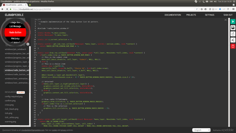
It turns out there are essentially two ways of developing Pebble apps. You can use a local devchain, built around Waf, QEMU and a custom C compiler. This offers a fully command line approach without an IDE, leaving you to choose your own environment to work in. Alternatively there's the much slicker CloudPebble Web IDE. This works entirely online, including the source editor, compiler and pebble emulator.

I worked through some of the tutorials on CloudPebble and was very impressed by it. The emulator works astonishingly well and I didn't feel restricted by being forced to use a browser-based editor. What I found particularly impressive was the ability to clone projects from GitHub straight into CloudPebble. This makes it ideal for testing out the example projects (all of which are up on GitHub). Without having to clutter up your local machine. Having checked the behaviour on the CloudPebble emulator, if it suits your needs you can then easily find the code to make it work and replicate it in your own projects.
Although there's much to recommend it, I'm always a bit suspicious of Web-based approaches. Experience suggests they can be less flexible than their command line equivalents, imposing a barrier on more complex projects. In the case of CloudPebble there's some truth to this. If you want to customise your build scripts (e.g. to pre-generate some files) or combine your watch app with an Android app, you'll end up having to move your build locally. In practice these may be the fringe cases, but it's worth being aware.
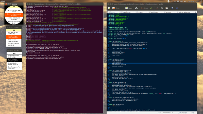
So it can be important to understand the local toolchain too. There's no particular IDE to use, but Pebble have created a Python wrapper around the various tools so they can all be accessed through the parameters of the pebble command.
Although it does many things, the most important are build, install and logs. The first compiles a .pbw file (a Pebble app, essentially a zip archive containing binary and resource files); the second uploads and runs the application; and the last offers runtime debugging. These will work on both the QEMU emulator, which can mimic any of the current three watch variants (Original, Time, Time Round; or aplite, basalt and chalk for those on first name terms), or a physical watch connected via a phone on the network.

It's all very well thought out and works well in practice. You quickly get used to the build-install-log cycle during day-to-day coding.
So, that's the dev tools in a nutshell, but what about the structure, coding and libraries of an actual app? The core of each app is written in C, so my first impression was that everything felt a bit OldSkool. It didn't take long for the picture to become more nuanced. Pebble have very carefully constructed a simple (from the developer's perspective) but effective event-based library. For communication between the watch and phone (and via that route to the wider Internet) the C hands over to fragments of Javascript that run on the phone. This felt bizarre and overcomplicated at first, but actually serves to bridge the otherwise rough boundary between embedded (watch) and abstract (phone) development. It also avoids having to deal with threading in the C portion of the code. All communication is performed using JSON, which gets converted to iterable key-value dictionaries when handled on the C side.
This seems to work well: the UI written in C remains fluid and lightweight with Javascript handling the more infrequent networking requirements.
The C is quite restrictive. For example, I quickly discovered there's no square root function, arguable one of the more useful maths functions on a round display (some trig is provided by cos and sin lookup functions). The libraries are split into various categories such as graphics, UI, hardware functions and so on. They're built as objects with their own hierarchy and virtual functions implemented as callbacks. It all works very well and with notable attention to detail. For example, in spite of it being C, the developers have included enough hooks for subclasses to be derived from the existing classes.
The downside to all of this is that you have to be comfortably multilingual: C for the main code and interface, Javascript for communication with a phone, Java and Objective-C to build companion Apps and Python for the build scripts. Whew.
Different people will want different things in a development environment: is it well structured? Does it support a developer's particular preference of language? Is it simple at the start but flexible enough to deal with more complex projects? Does it support different development and coding styles? How much boilerplate overhead is there before you can get going? How familiar does it all feel?
It just so happens that I really like C, but dislike Javascript, although I'm certain there are many more developers who feel the exact opposite. The Pebble approach is a nice compromise. I was happy dealing with the C and the Javascript part was logical (e.g. no need to deal with browser incompatibilities). If you're a died-in-the-wool Web developer, there's even a pre-build JS shim for creating watch faces.
So it also seems to work well together and I've come away impressed. Many developers will find the CloudPebble interface slicker and easier to use. But after wading through the underlying complexities – and opacity – of IDEs like Visual Studio and Eclipse, the thoughtful clarity of the Pebble SDK makes for a refreshing change. I wouldn't recommend it for a complete newcomer to C or JS, but if you have any experience with these languages, you'll find yourself up and running with the Pebble toolchain in no time.
Comment
As a consequence many of the apps I'd got used to on my Classic no longer appear in the app store for the Round. This, I thought, offered a perfect opportunity for me to get to grips with the SDK by upgrading some of those that are open source.
Although I'm a total newb when it comes to Pebble and smartwatch development generally, I have plenty more experience with other toolchains, SDKs and development environments, from Visual Studio and QT Creator through to GCC and Arduino IDE, as well as the libraries and platforms that go with them. I was interested to know how the Pebble dev experience would compare to these.
It turns out there are essentially two ways of developing Pebble apps. You can use a local devchain, built around Waf, QEMU and a custom C compiler. This offers a fully command line approach without an IDE, leaving you to choose your own environment to work in. Alternatively there's the much slicker CloudPebble Web IDE. This works entirely online, including the source editor, compiler and pebble emulator.

I worked through some of the tutorials on CloudPebble and was very impressed by it. The emulator works astonishingly well and I didn't feel restricted by being forced to use a browser-based editor. What I found particularly impressive was the ability to clone projects from GitHub straight into CloudPebble. This makes it ideal for testing out the example projects (all of which are up on GitHub). Without having to clutter up your local machine. Having checked the behaviour on the CloudPebble emulator, if it suits your needs you can then easily find the code to make it work and replicate it in your own projects.
Although there's much to recommend it, I'm always a bit suspicious of Web-based approaches. Experience suggests they can be less flexible than their command line equivalents, imposing a barrier on more complex projects. In the case of CloudPebble there's some truth to this. If you want to customise your build scripts (e.g. to pre-generate some files) or combine your watch app with an Android app, you'll end up having to move your build locally. In practice these may be the fringe cases, but it's worth being aware.
So it can be important to understand the local toolchain too. There's no particular IDE to use, but Pebble have created a Python wrapper around the various tools so they can all be accessed through the parameters of the pebble command.
Pebble Tool command:

    build               Builds the current project.
    clean
    new-project         Creates a new pebble project with the given name in a
                        new directory.
    install             Installs the given app on the watch.
    logs                Displays running logs from the watch.
    screenshot          Takes a screenshot from the watch.
    insert-pin          Inserts a pin into the timeline.
    delete-pin          Deletes a pin from the timeline.
    emu-accel           Emulates accelerometer events.
    emu-app-config      Shows the app configuration page, if one exists.
    emu-battery         Sets the emulated battery level and charging state.
    emu-bt-connection   Sets the emulated Bluetooth connectivity state.
    emu-compass         Sets the emulated compass heading and calibration
                        state.
    emu-control         Control emulator interactively
    emu-tap             Emulates a tap.
    emu-time-format     Sets the emulated time format (12h or 24h).
    ping                Pings the watch.
    login               Logs you in to your Pebble account. Required to use
                        the timeline and CloudPebble connections.
    logout              Logs you out of your Pebble account.
    repl                Launches a python prompt with a 'pebble' object
                        already connected.
    transcribe          Starts a voice server listening for voice
                        transcription requests from the app
    data-logging        Get info on or download data logging data
    sdk                 Manages available SDKs
    analyze-size        Analyze the size of your pebble app.
    convert-project     Structurally converts an SDK 2 project to an SDK 3
                        project. Code changes may still be required.
    kill                Kills running emulators, if any.
    wipe                Wipes data for running emulators. By default, only
                        clears data for the current SDK version.
Although it does many things, the most important are build, install and logs. The first compiles a .pbw file (a Pebble app, essentially a zip archive containing binary and resource files); the second uploads and runs the application; and the last offers runtime debugging. These will work on both the QEMU emulator, which can mimic any of the current three watch variants (Original, Time, Time Round; or aplite, basalt and chalk for those on first name terms), or a physical watch connected via a phone on the network.

It's all very well thought out and works well in practice. You quickly get used to the build-install-log cycle during day-to-day coding.
So, that's the dev tools in a nutshell, but what about the structure, coding and libraries of an actual app? The core of each app is written in C, so my first impression was that everything felt a bit OldSkool. It didn't take long for the picture to become more nuanced. Pebble have very carefully constructed a simple (from the developer's perspective) but effective event-based library. For communication between the watch and phone (and via that route to the wider Internet) the C hands over to fragments of Javascript that run on the phone. This felt bizarre and overcomplicated at first, but actually serves to bridge the otherwise rough boundary between embedded (watch) and abstract (phone) development. It also avoids having to deal with threading in the C portion of the code. All communication is performed using JSON, which gets converted to iterable key-value dictionaries when handled on the C side.
This seems to work well: the UI written in C remains fluid and lightweight with Javascript handling the more infrequent networking requirements.
The C is quite restrictive. For example, I quickly discovered there's no square root function, arguable one of the more useful maths functions on a round display (some trig is provided by cos and sin lookup functions). The libraries are split into various categories such as graphics, UI, hardware functions and so on. They're built as objects with their own hierarchy and virtual functions implemented as callbacks. It all works very well and with notable attention to detail. For example, in spite of it being C, the developers have included enough hooks for subclasses to be derived from the existing classes.
The downside to all of this is that you have to be comfortably multilingual: C for the main code and interface, Javascript for communication with a phone, Java and Objective-C to build companion Apps and Python for the build scripts. Whew.
Different people will want different things in a development environment: is it well structured? Does it support a developer's particular preference of language? Is it simple at the start but flexible enough to deal with more complex projects? Does it support different development and coding styles? How much boilerplate overhead is there before you can get going? How familiar does it all feel?
It just so happens that I really like C, but dislike Javascript, although I'm certain there are many more developers who feel the exact opposite. The Pebble approach is a nice compromise. I was happy dealing with the C and the Javascript part was logical (e.g. no need to deal with browser incompatibilities). If you're a died-in-the-wool Web developer, there's even a pre-build JS shim for creating watch faces.
So it also seems to work well together and I've come away impressed. Many developers will find the CloudPebble interface slicker and easier to use. But after wading through the underlying complexities – and opacity – of IDEs like Visual Studio and Eclipse, the thoughtful clarity of the Pebble SDK makes for a refreshing change. I wouldn't recommend it for a complete newcomer to C or JS, but if you have any experience with these languages, you'll find yourself up and running with the Pebble toolchain in no time.