List items
Items from the current list are shown below.
Blog
All items from January 2016
Everything is driven by the narrative, which takes a layered approach. There’s no choice as such and this isn’t a choose-your-own adventure. In spite of that, a huge amount of trust is bestowed on the player which allows them to miss large portions of the story if they so choose. This trust is rooted in the mechanics of the game rather than the story, and ultimately makes the game far more rewarding.
To understand this better we need to deconstruct the game with a more analytic approach. A good place to start with this is the gameplay mechanics, but it will inevitably require us to consider the story as well. So, here be spoilers. If you’ve not yet played the game, I urge you to do so before reading any further.
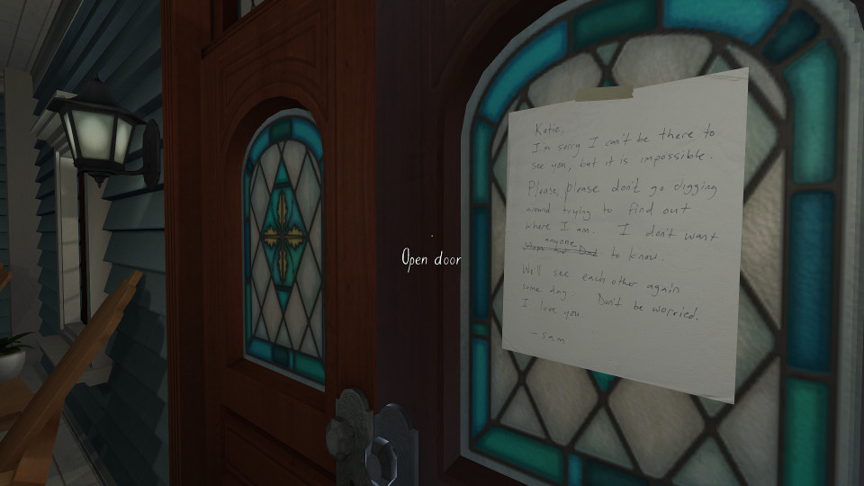
Even though the game is full 3D first-person perspective, the mechanics are pretty sparse. The broad picture is that you have scope to move around the world, pick up and inspect objects, discover ‘keys’ to unlock new areas, and listen to audio diaries. This is a common mechanic used in games and even the use of audiologs has become somewhat of a gaming trope. The widely acclaimed Bioshock franchise uses them as an important (but not the only) narrative device. They’re used similarly in Dead Space, Harley Quinn’s recordings in Batman, the audiographs in Dishonored, and the audio diaries in the rebooted Tomb Raider. Variants include Deus Ex’s email conversations and Skyrim’s many books that provide context for the world. There are surely many others, but while some of these rely heavily on audiologs to maintain their story, few of them use it as a central gameplay mechanic. Bioshock, for example, emphasises fight sequences far more and includes interactions with other characters such as Atlas or Elizabeth for story development. Gone Home provides perhaps the most pure example of the use of audiologs as a central mechanic.
So mechanically this is a pure exploration game. This makes it an ideal game for further analysis, since the depth of mechanics remain tractable. As we’ll see, the mechanics in play actually feel sparser than they are. By delving just a bit into the game we find there’s more going on than we might have imagined on first inspection.
Starting with the interactions, we can categorise theses into eight core ‘active’ mechanics and a further five ‘passive’ types.
Active interaction types
- Movement and crouching/zooming
- Picking up objects
- Full rotation
- Lateral rotation
- Reading (possibly with multiple pages)
- Adding an object to your backpack
- Triggering a journal entry
- Playing an audio cassette
- Return object to the same place
- Throw object
- Turn on/off an object (e.g. light, fan, record player, TV)
- Open/close door (including some with locks or one-way entry)
- Open/close cupboards/drawers
- Lock combinations
- Hover text
- Reading object
- Finding clues in elusive hard-to-see places
- Viewing places ahead-of-time (e.g. conservatory)
- Magic eye pictures
While the key mechanism for driving the narrative forward is exploration through inspecting objects, it’s perhaps more enlightening to first understand the mechanisms used to restrict progress. All games must balance player agency against narrative cohesion. If the player skips too far forward they may miss information that’s essential for understanding the story. If the player is forced carefully along a particular route the sense of agency is lost, and can also lead to frustration if progress is hindered unnecessarily. Sitting in between is a middle ground that trusts the player to engage with the game and relies on them to manage and reconstruct information that may be presented out-of-order, incomplete and in multiple ways.
There are then seven main ‘bulkheads’ (K1-K7) that define eight areas that force the narrative to follow a given sequence. On top of this there are two optional ‘sidequest bulkheads’ (K8, K9). The map itself can be split into twelve areas, and the additional breakpoints help direct the flow of the player, although where no keys are indicated this occurs through psychological coercion rather than compulsion.
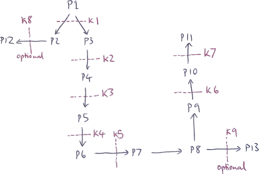
These areas shown in the diagram are as follows.
- P1. Porch
- P2. Ground floor west
- P3. Upstairs
- P4. Stairs between upstairs and library
- P5. Three secret panels
- P6. Locker
- P7. Basement
- P8. Stairs between basement, guestroom and ground floor east
- P9. Ground floor east
- P10. Room under the stairs
- P11. Attic
- P12. Filing cabinet (optional)
- P13. Safe (optional)
- K1. Christmas duck key
- K2. Sewing room map
- K3. Secret panel map
- K4. Locker combination
- K5. Basement key
- K6. Map to room under stairs in conservatory
- K7. Attic key
- K8. Safe combination in library (optional)
- K9. Note in guestroom (optional)
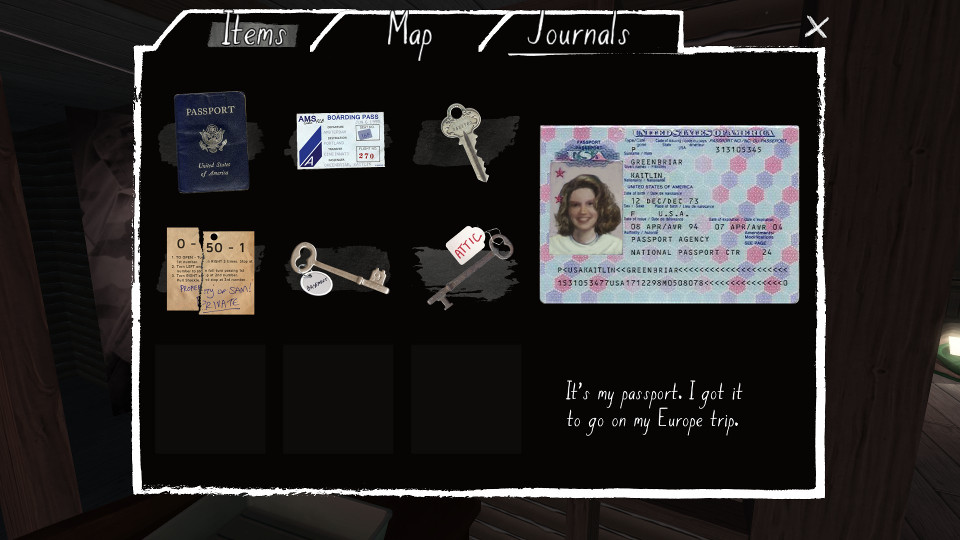
Given there are twenty five audio diaries, and a huge number of other written items and objects which add to the story, it’s clear that The Fullbright Company (the Gone Home developers) assume a reasonable amount of flexibility in the ordering of the information within these eight areas. It’s very easy to miss a selection of them on a single run-through of the game.
The diaries themselves only capture the main narrative arc – Sam’s coming-of-age – which interacts surprisingly loosely with the other arcs that can be found. These can be most easily understood by categorising them in terms of characters:
- Sam’s coming-of-age (sister)
- Terrance’s literary career (Dad)
- Jan’s affair (Mum)
- Oscar’s life (great uncle)
- Kaitlin’s travel (protagonist)
An interesting feature of these stories is that they each conform to different literary genres, and this helps to obscure the nature of the story, allowing the ending to remain a surprise up until the last diary entry. Terrance’s career has elements of tragedy which are reinforced by the counterbalancing romance of Jan’s affair. Oscar’s story, which is inseparable from that of the house itself, introduces elements of horror. Kaitlin’s story is the least developed, but is perhaps seen best as a detective story driven by the player. Even though you act through Kaitlin as the protagonist, it’s clearly Sam who’s star of the show. Even though it’s clear from early on that the main narrative, seen through Sam’s eyes, is a coming-of-age story, the ending that defines the overall mood (love story, tragedy?) is left open until the very end.
Perhaps another interesting feature is the interplay between the genres and the mechanics. The feel of the game, with bleak weather, temperamental lighting, darkened rooms and careful exploration, is one of survival horror. Initially it seems like the game might fall into this category, with Oscar’s dubious past and the depressed air. This remains a recurrent theme throughout. But ultimately this is used more to provide a backdrop to Sam’s story, transporting Kaitlin through her (your) present-day experiences to those of Sam as described through her audio diaries and writings.
Ultimately then, it’s possible to deconstruct Gone Home into its thirteen main interaction types, eight areas and five narrative arcs. This provides the layering for a rich story and involving game, even though, compared to many of its contemporaries in the gaming arena, it’s mechanically rather limited. By delving into it I was hoping it might provide some insight into how the reverse can take place: the construction of a game based on a fixed set of mechanics and restricted world. It goes without saying that the impact of the story comes from its content and believability, along with pitching the trust balance in the right spot. Neither of these can be captured in an easily reproducible form.
Nonetheless it would be really neat if it were possible to derive a formal approach from this for simplifying the process of creating new material that follows a similar layered narrative approach. Unlike many games Gone Home is complex enough to be enjoyable but simple enough to understand as a whole. It was certainly one of my favourite games of 2014, and if there's a formula for getting such things right, it's a game that's worth replicating.
Addendum: I wrote this back in July 2014 while lecturing on the Computer Games Development course at Liverpool John Moores Univrsity and recently rediscovered it languishing on my hard drive. At the time I thought it might be of interest to my students and planned to develop it into a proper theory. Since I never got around to doing so, and now probably never will, I felt I may as well publish it in its present form.
This week it explained how getting over writer's block is simply a case of being disciplined: the trick to writing is to write often and in small doses. Not only should you create a schedule to start, but you should also create a schedule to stop. Once your time runs out, stop writing immediately ("even if you've got momentum and could write more"). It's the same advice that was given to me about revision when I was sixteen and is probably as valid now as it was then.
The advice apparently comes from a book by Robert Boice. I was a bit dismissive of the claim in the article that used copies sell for $190, but I've just checked on Amazon and FastShip is selling it for $1163 (Used - Acceptable). That's $4 per page, so it must be saturated with wisdom.
My interest was piqued by the fact that the book's aimed at academics struggling to write. I wouldn't say I struggle to write, but I would say I struggle to write well. Following Boice's advice, writing often and in small doses should probably help with that, but here are a few other things I genuinely think will probably help if - like me - you want to improve your writing ability.
- Read a lot. Personally I find it much easier to get started if I already have a style in mind. Mimicking a style makes the process less personal, and that distance can make it easier (at least for me, but this might only work if you suffer from repressed-Britishness). For the record and to avoid any claims of deception from those who know me, I do hardly any reading.
- Plan and structure. Breaking things into smaller pieces makes them more manageable and once you have the headings it's just a case of filling in the blanks. Planning what you intend to say will result in better arguments and more coherent ideas.
- Leave out loads of ideas. Clear ideas are rarely comprehensive and if you try to say everything you'll end up with a web of thoughts rather than a nice linear progression.
- Let it settle overnight. Sometimes the neatest structures and strongest ideas are the result of fermentation rather than sugar content. I don't really know what that means, but hopefully you get the idea.
- Don't let it settle for another night. It's better to write something than to allow it to become overwhelming.
- And most important of them all... oh, time's up.
The Pebble Time Round can't entirely shed its geek chic ancestry. The round digital face suffers from a sub-optimally wide bezel. The colour e-ink display - although with many advantages - simply isn't as vivid and crisp as most other smartwatches on the market.
In spite of this, Pebble have managed to create a near perfect smartwatch for my purposes. I still get a kick out of receiving messages on my watch. My phone, which used to sit on my desk in constant need of attention now stays in my pocket muted and with vibration turned off. Whenever some communication arrives I can check it no matter what I'm doing in the space of three seconds. For important messages this isn't a great advantages; where the real benefit lies is in avoiding the disruption caused by all those unimportant messages that can be left until later.
Obviously the apps are great too. In practice I've found myself sticking to just a few really useful apps, but those few that do stick make me feel like I'm living in the future I was promised as a child. Most of all, the real excitement comes from being able to program the thing. There's nothing more thrilling than knowing there's a computer on my wrist that's just waiting to do anything asked of it, imagination and I/O permitting. I would say that though, wouldn't I?!
Of course, that's not just true for Pebble; you could say the same for just about any current generation smartwatch: Google Wear, iWatch, Tizen, whatever. Still, it's great that Pebble are forging a different path to these others, focussing on decent battery life, nonemissive displays and a minimalist interface design.
For the last decade I've been dismissive of watches in general and never felt the need to wear one. I arrived late to the smartwatch party, but aving taken the time to properly try some out, I'm now convinced they're a viable form factor. Even if only to fulfil the childhood fantasies of middle-aged geeks like me, they'll surely be here to stay (after all, there's a lot of us around!).
The central point Maciej makes is that websites have become script-ridden quagmires of bloat. Even viewing a single tweet will result in nearly a megabyte of download. He identifies a few reasons for this. First that ever increasing bandwidth and decreasing latency means web developers don't notice how horrifically obese their creations have become. While the problem is well-known with no end of articles discussing the issue and presenting approaches for fixing it, they invariably miss the point. They focus on complex, clever optimisations, rather than straightforward byte-count. Those that do consider byte-count can make things worse by shifting the goalposts upwards, inflating what can be considered 'normal'. Finally, the unsustainability of the Web economy has led to the scaffold of scripts used by advertisers and trackers to accelerate in complexity.
There are some sublime examples in the presentation, like the 400-word article complaining about bloat that itself manages to somehow accumulate 1.2 megabytes of fatty residue on its way through the interflume arteries. If you've not read it, go do so now and heed its message.
Like I said, the last thing I need is distractions right now, which is why the article immediately prompted me to check my own website's bandwidth stats. Having nodded along enthusiastically with everything written in Maciej's presentation, I could hardly just leave it there. I needed to apply the Russian Literature Test:
"text-based websites should not exceed in size the major works of Russian literature"
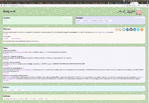
What I found was pretty embarrassing. The root page is one of the simplest on my site. Here's what it looks like:
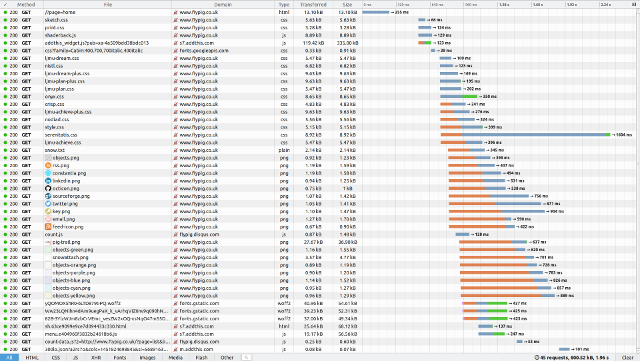
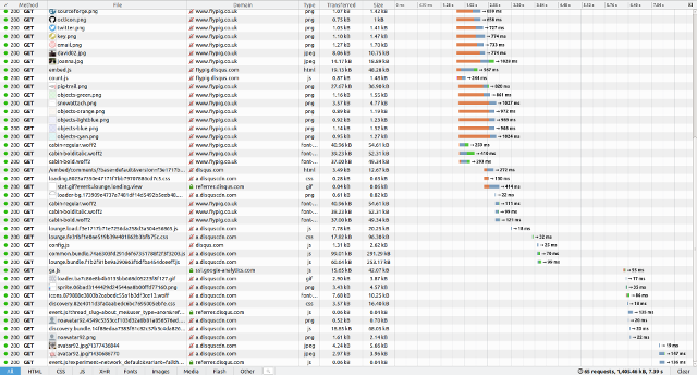
Yet it weighed in at 800KB. That's the same size as a "the full text of The Master and Margarita" by Bulgakov. Where's all that bandwidth going? The backend of my site is like Frankenstein's monster: cobbled together from random bits of exhumed human corpse. Nonetheless it should make it relatively terse in its output and it certainly shouldn't need all that. Checking with Mozilla's developer tools, here's what I found.
There are some worrying things here. For some reason the server spent ages sitting on some of the CSS requests. More worrying yet is that the biggest single file is the widget script for AddThis. I've been using AddThis to add a 'share' button to my site. No-one ever uses it. The script for the button adds nearly a third of a megabyte to the size, and also gives AddThis the ability to track anyone visiting the site without their knowledge.
Not good; so I dug around on the Web and found an alternative called AddToAny. It doesn't use any scripts, just slurps the referrer URL if you happen to click on the link. This means it also doesn't track users unless they click on the link. Far preferable.
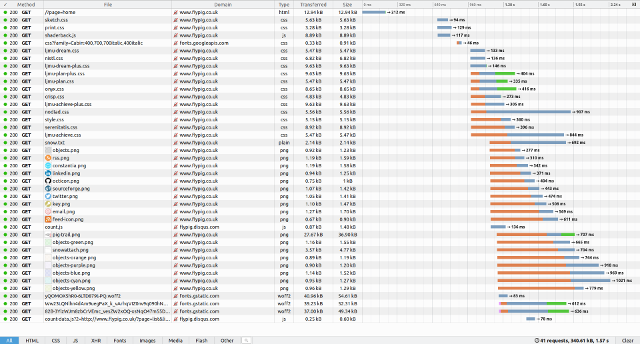
After making this simple change, the network stats now look a lot healthier.
Total bandwidth moved from 800KB to 341KB, cutting it by over a half (see the totals in the bottom right corners). It also reduced load time from 2s down to 1.5s.
But I wasn't done yet. I harbour a pathological distrust of Apple, Google, Facebook and Microsoft, and ditched my Google account over a year ago. I've always been sad about this because Google in particular makes some excellent products that I'd otherwise love to use. Google Fonts is a case in point, with its rich collection of high quality typefaces and a really easy API for using them on the web. Well look there in the downloads and you'll see my site pulls down 150KB of font data from Google. That's the Cabin font used on the site if you're interested.
Sadly then, in my zeal to minimise Google's ability to track me, I totally ignored the plight of those visiting my site. Every time the font is downloaded Google gets some juicy analytics for it to hoard and mine.
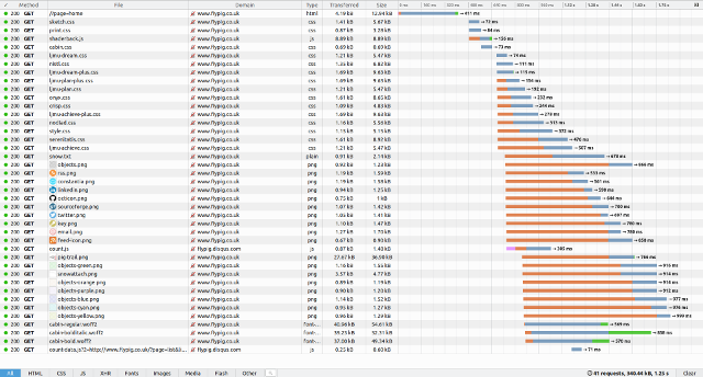
The solution I've chosen is to copy the fonts over to my own server (the fonts themselves are open source, so that's okay). Google's servers are considerably faster at responding than my shared-hosting server, but the change doesn't seem to impact the overall download time, and even reduces the overall size by 0.17KB (relative URLs are shorter!). Okay, that's not really a benefit, but the lack of tracking surely is.
The final result has increased page load and reduced bandwidth usage to less than Fyodor Dostoyevsky's The Gambler, which I think is fitting given Dostoyevsky was forced to keep it short, writing to a deadline to pay off his gambling debts. Russian Literature Test passed!
I feel chuffed that my diversionary tactics yielded positive results. All is not quite peachy in the orchard though. Many will argue that including a massive animated background on my page is hypocritical, and they're probably right. Although the shader's all of 2KB of source, it'll be executed 100 million times per second on a 4K monitor. Some of the pages also use Disqus for the comments. I've never really liked having to use Disqus, but I feel forced to include some kind of pretence at being social. Here's why it's a problem.
Not only does Disqus pull in hundreds of KB of extra data, it also provides another perfect Trojan horse for tracking. I've not yet found a decent solution to this, and I fear the Web is just too busy eating itself to allow for any kind of sensible fix.

