List items
Items from the current list are shown below.
Blog
12 Nov 2019 : Graphs of Waste, Part 1: Choose Your Graph Wisely #
I have to admit I'm a bit of a data visualisation pedant. If I see data presented in a graph, I want the type of graph chosen to match the expressive aim of the visualisation. A graph should always aim to expose some underlying aspect of the data that would be hard to discern just by looking at the data in a table. Getting this right means first and foremost choosing the correct modality, but beyond that the details are important too: colours, line thicknesses, axis formats, labels, marker styles. All of these things need careful consideration.
You may think this is all self-evident, and that anyone taking the trouble to plot data in a graph will obviously have taken these things into account, but sadly it's rarely the case. I see data visualisation abominations on a daily basis. What's more it's often the people you'd expect to be best at it who turn out to fall into the worst traps. Over fifteen years of reviewing academic papers in computer science, I've seen numerous examples of terrible data visualisation. These papers are written by people who have both access to and competence in the best visualisation tooling, and who presumably have a background in analytical thinking, and yet graphs presented in papers often fail the most basic requirements. It's not unusual to see graphs that are too small to read, with unlabelled axes, missing units, use of colour in greyscale publications, or with continuous lines drawn between unrelated discrete data points.
And that's without even mentioning pseudo-3D projections or spider graphs.
One day I'll take the time to write up some of these data visualisation horror stories, but right now I want to focus on one of my own infractions. I'll warn you up front that it's not a pretty story, but I'm hoping it will have a happy ending. I'm going to talk about how I created a most terrible graph, and how I've attempted to redeem myself by developing what I believe is a much clearer representation of the data.
Over the last couple of months I've been collecting data on how much waste and recycling I generate. Broadly speaking this is for environmental and motivational reasons: I believe that if I make myself more aware of how much rubbish I'm producing, it'll motivate me to find ways to reduce it, and also help me understand where my main areas for improvement are. If I'm honest I don't expect it'll work (many years ago I was given a device for measuring real-time electricity usage with a similar aim and I can't say that succeeded), but for now it's important to understand my motivations. It goes to the heart of what makes a good graphing choice.
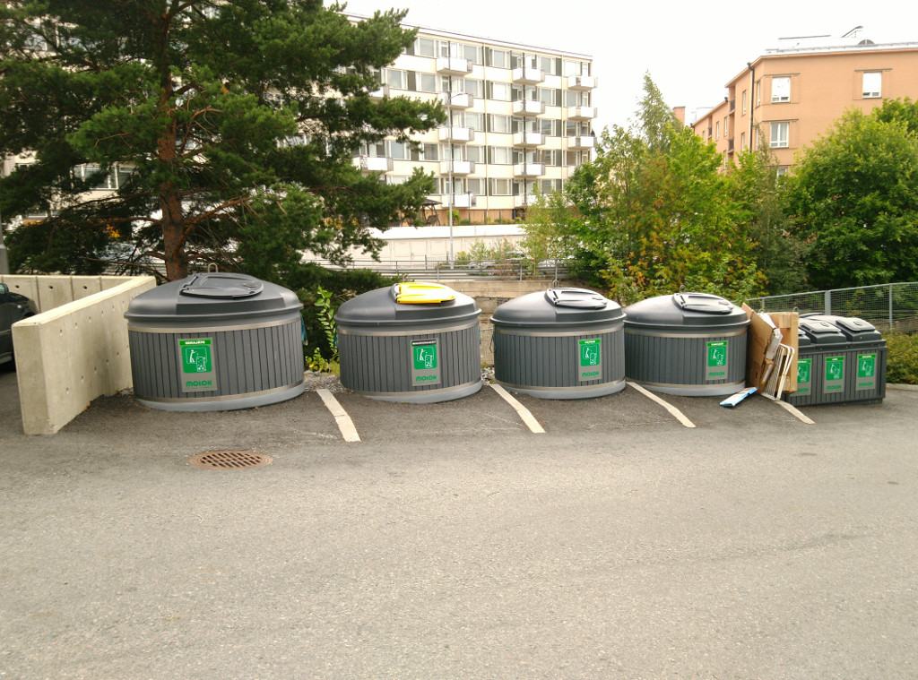
So, each week I weigh my rubbish using kitchen scales, categorised into different types matching the seven different recycling bins provided for use in my apartment complex.
Here's the data I've collected until now presented in a table.
We can't tell a great deal from this table. We can certainly read off the measurements very easily and accurately, but beyond that the table fails to give any sort of overall picture or idea of trends.
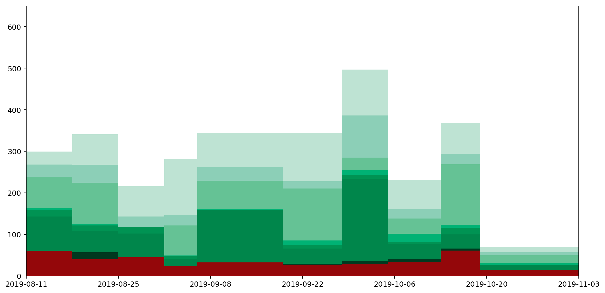
The obvious thing to do is therefore to draw a graph and hope to tease out something that way. So, here's the graph I came up with, and which I've had posted and updated on my website for a couple of months.
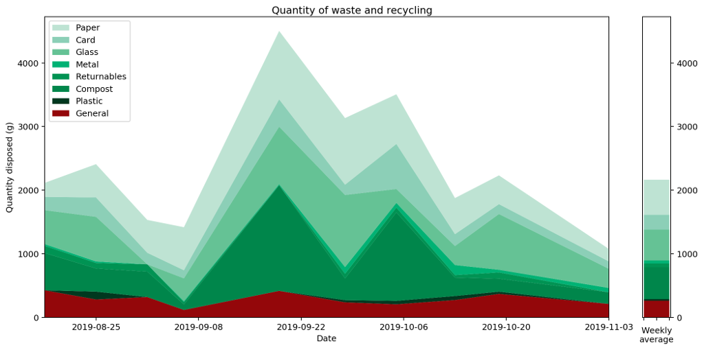
What does this graph show? Well, to be precise, it's a stacked plot of the weight measurements against the dates the measurements were taken. It gives a pretty clear picture of how much waste I produced over a period of time. We can see that my waste output increased and peaked before falling again, and that this was mostly driven by changes in the weight of compost I produced.
Or does it? In fact, as the data accumulated on the graph, it became increasingly clear that this is a misleading visualisation. Even though it's an accurate plot of the measurements taken, it gives completely the wrong idea about how much waste I've been generating.
To understand this better, let's consider just one of the stacked plots. The red area down at the base is showing the measurements I took for general waste. Here's another graph that shows the same data isolated from the other types of waste and plotted on a more appropriate scale.
If you're really paying attention you'll notice that the start date on this second graph is different to that of the first. That's because the very first datapoint represents my waste output for the seven days prior to the reading, and we'll need those extra seven days for comparison with some of the other plots we'll be looking at shortly.
There are several things wrong with this plot, but the most serious issue, the one I want to focus on, is that it gives a completely misleading impression of how much waste I've been generating. That's because the most natural way to interpret this graph would be to read off the value for any given day and assume that's how much waste was generated that day. This would leave the area under the graph being the total amount of waste output. In fact the lines simply connect different data points. The actual datapoints themselves don't represent the amount of waste generated in a day, but in fact the amount generated in a week. And because I don't always take my measurements at the same time each week, they don't even represent a week's worth of rubbish. To find out the daily waste generated, I'd need to divide a specific reading by the number of days since the last reading.
Take for example the measurements taken on the 6th September. I usually weight my rubbish on a Saturday, but because I went on holiday on the 7th I had to do the weighing a day early. Then I was away from home for seven days, came back and didn't then weight my rubbish again until the 19th, nearly two weeks later.
Although I spent a chunk of this time away, it still meant that the reading was high, making it look as if I'd generated a lot of waste over the two-week period. In fact, considering this was double the time of the usual readings, it was actually a relatively low reading. This should be reflected in the graph, but it's not. It looks like I generated more rubbish than expected; in fact I generated less.
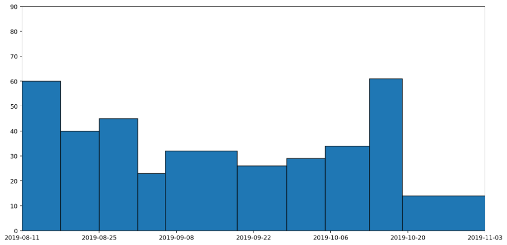
We can see this more clearly if we plot the data as a column (bar) graph and as a histogram. Here's the column graph first.
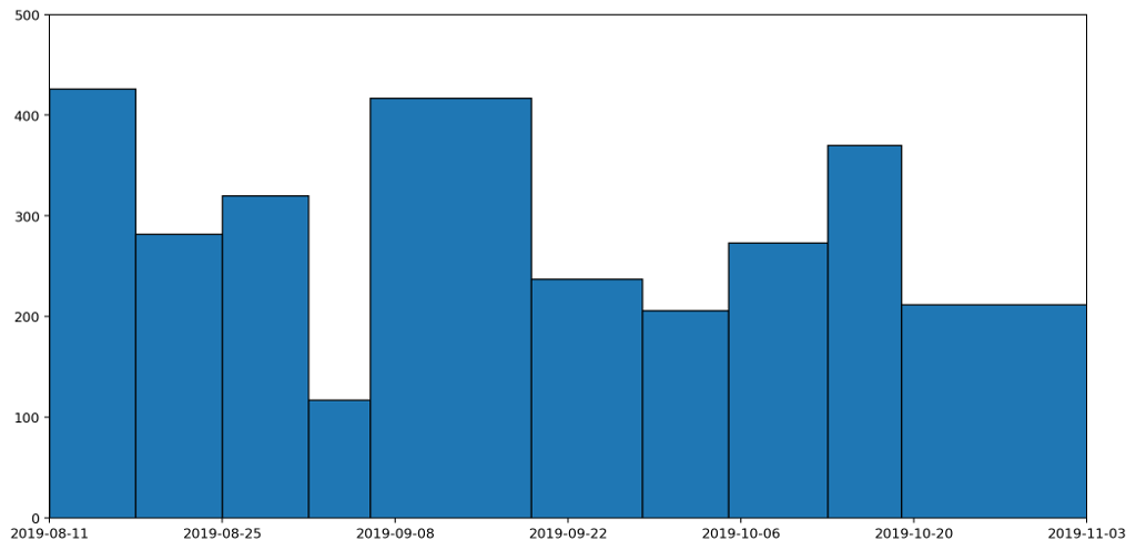
These are the same datapoints as in the previous graph, but drawn as columns with widths proportional to the duration that the readings represent. The column that spreads across from the 6th to the 19th September is the reading we've just been discussing. This is a tall, wide, column because it represents a long period (nearly two weeks) and a heaver than usual weight reading (because it's more than a weeks' worth of rubbish). If we now convert this into a histogram, it'll give us a clearer picture of how much waste was being generated per day.
This histogram takes each of the columns and divides it by the number of days the column represents. A histogram has the nice property that the area — rather than the height — of a column represents the value being plotted. In this histogram, the area under all of the columns represents the quantity of waste that I've generated across the entire period: the more blue, the more waste.
Not only is this a much clearer representation, it also completely changes the picture. The original graph made it look like my waste output peaked in the middle. There is a slight rise in the middle, but it's actually just a local maximum. In fact the overall trend was that my daily general waste output was decreasing until the middle of the period, and then rose slightly over time. That's a much more accurate reflection of what actually happened.
It would be possible to render the data as a stacked histogram, and to be honest I'd be happy with that. The overall picture, which ties in with my motivation for wanting the graph in the first place, indicates how much waste I'm generating based on the area under the graph.

But in fact I tend to be generating small bits of rubbish throughout the week, and I'd like to see the trend between readings, so it would be reasonable to draw a line between weeks rather than have them as histogram blocks or columns.
So this leads us down the path of how we might draw a graph that captures these trends, but still also retains the nice property that the area under the graph represents the amount of waste produced.
That's what I'll be exploring in part two.
All of the graphs here were generated using the superb MatPlotLib.
You may think this is all self-evident, and that anyone taking the trouble to plot data in a graph will obviously have taken these things into account, but sadly it's rarely the case. I see data visualisation abominations on a daily basis. What's more it's often the people you'd expect to be best at it who turn out to fall into the worst traps. Over fifteen years of reviewing academic papers in computer science, I've seen numerous examples of terrible data visualisation. These papers are written by people who have both access to and competence in the best visualisation tooling, and who presumably have a background in analytical thinking, and yet graphs presented in papers often fail the most basic requirements. It's not unusual to see graphs that are too small to read, with unlabelled axes, missing units, use of colour in greyscale publications, or with continuous lines drawn between unrelated discrete data points.
And that's without even mentioning pseudo-3D projections or spider graphs.
One day I'll take the time to write up some of these data visualisation horror stories, but right now I want to focus on one of my own infractions. I'll warn you up front that it's not a pretty story, but I'm hoping it will have a happy ending. I'm going to talk about how I created a most terrible graph, and how I've attempted to redeem myself by developing what I believe is a much clearer representation of the data.
Over the last couple of months I've been collecting data on how much waste and recycling I generate. Broadly speaking this is for environmental and motivational reasons: I believe that if I make myself more aware of how much rubbish I'm producing, it'll motivate me to find ways to reduce it, and also help me understand where my main areas for improvement are. If I'm honest I don't expect it'll work (many years ago I was given a device for measuring real-time electricity usage with a similar aim and I can't say that succeeded), but for now it's important to understand my motivations. It goes to the heart of what makes a good graphing choice.
So, each week I weigh my rubbish using kitchen scales, categorised into different types matching the seven different recycling bins provided for use in my apartment complex.
Here's the data I've collected until now presented in a table.
| Date | Paper | Card | Glass | Metal | Returnables | Compost | Plastic | General |
|---|---|---|---|---|---|---|---|---|
| 18/08/19 | 221 | 208 | 534 | 28 | 114 | 584 | 0 | 426 |
| 25/08/19 | 523 | 304 | 702 | 24 | 85 | 365 | 123 | 282 |
| 01/09/19 | 517 | 180 | 0 | 0 | 115 | 400 | 0 | 320 |
| 06/09/19 | 676 | 127 | 360 | 14 | 36 | 87 | 0 | 117 |
| 19/09/19 | 1076 | 429 | 904 | 16 | 0 | 1661 | 0 | 417 |
| 28/09/19 | 1047 | 162 | 1133 | 105 | 74 | 341 | 34 | 237 |
| 05/10/19 | 781 | 708 | 218 | 73 | 76 | 1391 | 54 | 206 |
| 13/10/19 | 567 | 186 | 299 | 158 | 40 | 289 | 63 | 273 |
We can't tell a great deal from this table. We can certainly read off the measurements very easily and accurately, but beyond that the table fails to give any sort of overall picture or idea of trends.
The obvious thing to do is therefore to draw a graph and hope to tease out something that way. So, here's the graph I came up with, and which I've had posted and updated on my website for a couple of months.
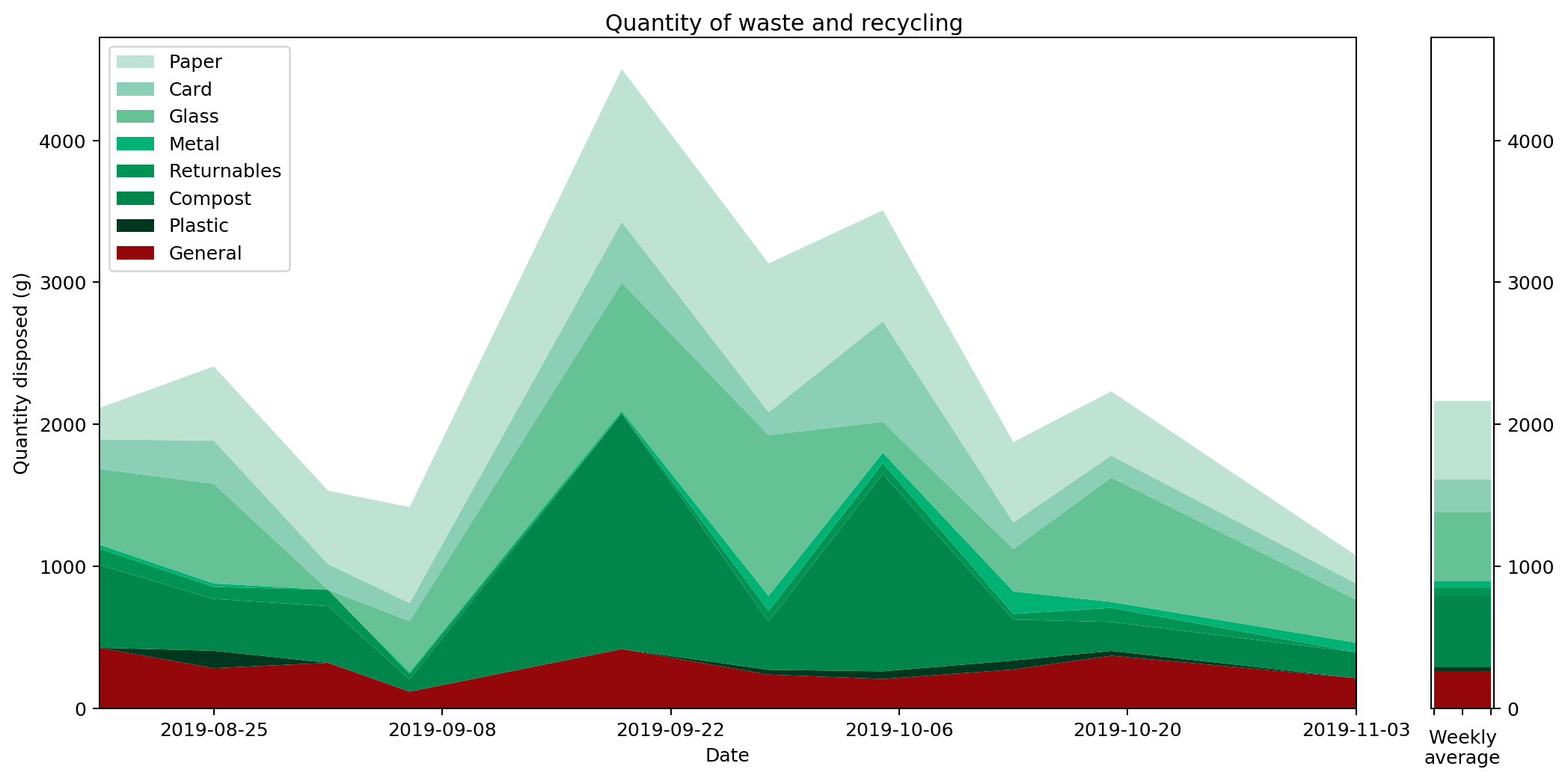
What does this graph show? Well, to be precise, it's a stacked plot of the weight measurements against the dates the measurements were taken. It gives a pretty clear picture of how much waste I produced over a period of time. We can see that my waste output increased and peaked before falling again, and that this was mostly driven by changes in the weight of compost I produced.
Or does it? In fact, as the data accumulated on the graph, it became increasingly clear that this is a misleading visualisation. Even though it's an accurate plot of the measurements taken, it gives completely the wrong idea about how much waste I've been generating.
To understand this better, let's consider just one of the stacked plots. The red area down at the base is showing the measurements I took for general waste. Here's another graph that shows the same data isolated from the other types of waste and plotted on a more appropriate scale.
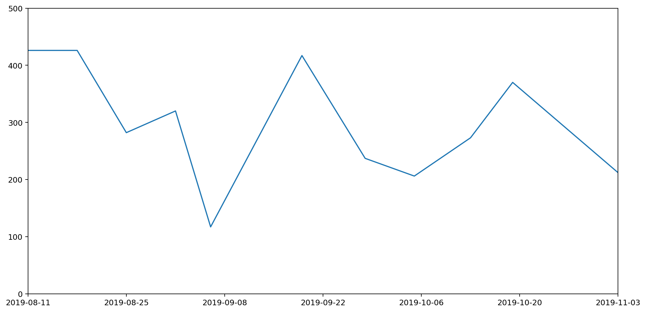
If you're really paying attention you'll notice that the start date on this second graph is different to that of the first. That's because the very first datapoint represents my waste output for the seven days prior to the reading, and we'll need those extra seven days for comparison with some of the other plots we'll be looking at shortly.
There are several things wrong with this plot, but the most serious issue, the one I want to focus on, is that it gives a completely misleading impression of how much waste I've been generating. That's because the most natural way to interpret this graph would be to read off the value for any given day and assume that's how much waste was generated that day. This would leave the area under the graph being the total amount of waste output. In fact the lines simply connect different data points. The actual datapoints themselves don't represent the amount of waste generated in a day, but in fact the amount generated in a week. And because I don't always take my measurements at the same time each week, they don't even represent a week's worth of rubbish. To find out the daily waste generated, I'd need to divide a specific reading by the number of days since the last reading.
Take for example the measurements taken on the 6th September. I usually weight my rubbish on a Saturday, but because I went on holiday on the 7th I had to do the weighing a day early. Then I was away from home for seven days, came back and didn't then weight my rubbish again until the 19th, nearly two weeks later.
Although I spent a chunk of this time away, it still meant that the reading was high, making it look as if I'd generated a lot of waste over the two-week period. In fact, considering this was double the time of the usual readings, it was actually a relatively low reading. This should be reflected in the graph, but it's not. It looks like I generated more rubbish than expected; in fact I generated less.
We can see this more clearly if we plot the data as a column (bar) graph and as a histogram. Here's the column graph first.
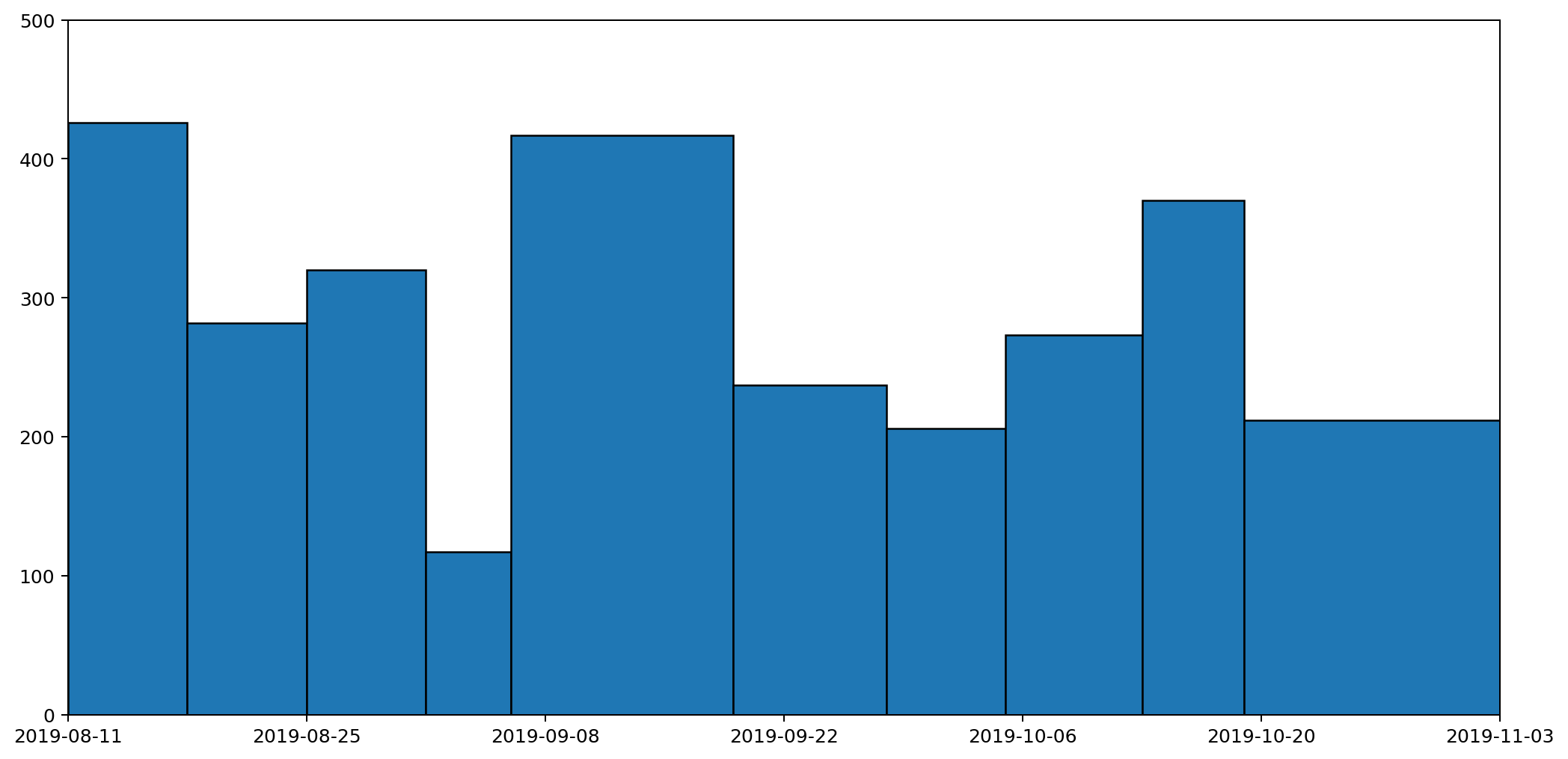
These are the same datapoints as in the previous graph, but drawn as columns with widths proportional to the duration that the readings represent. The column that spreads across from the 6th to the 19th September is the reading we've just been discussing. This is a tall, wide, column because it represents a long period (nearly two weeks) and a heaver than usual weight reading (because it's more than a weeks' worth of rubbish). If we now convert this into a histogram, it'll give us a clearer picture of how much waste was being generated per day.
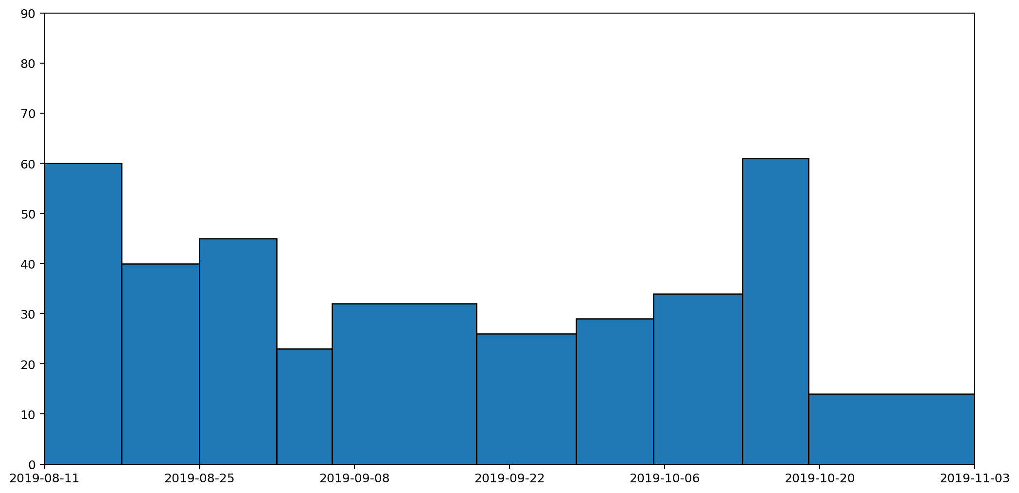
This histogram takes each of the columns and divides it by the number of days the column represents. A histogram has the nice property that the area — rather than the height — of a column represents the value being plotted. In this histogram, the area under all of the columns represents the quantity of waste that I've generated across the entire period: the more blue, the more waste.
Not only is this a much clearer representation, it also completely changes the picture. The original graph made it look like my waste output peaked in the middle. There is a slight rise in the middle, but it's actually just a local maximum. In fact the overall trend was that my daily general waste output was decreasing until the middle of the period, and then rose slightly over time. That's a much more accurate reflection of what actually happened.
It would be possible to render the data as a stacked histogram, and to be honest I'd be happy with that. The overall picture, which ties in with my motivation for wanting the graph in the first place, indicates how much waste I'm generating based on the area under the graph.
But in fact I tend to be generating small bits of rubbish throughout the week, and I'd like to see the trend between readings, so it would be reasonable to draw a line between weeks rather than have them as histogram blocks or columns.
So this leads us down the path of how we might draw a graph that captures these trends, but still also retains the nice property that the area under the graph represents the amount of waste produced.
That's what I'll be exploring in part two.
All of the graphs here were generated using the superb MatPlotLib.
Comments
Uncover Disqus comments