List items
Items from the current list are shown below.
Waste
All items from November 2019
30 Nov 2019 : Waste data #
Staying on a pretty even keel this week with my waste output. Just lightly up on last week (more card, for some reason) but still below average.
26 Nov 2019 : Graphs of Waste, Part 3: A Continuously Differentiable Histogram Approach #
In part one we looked at how graphs can be a great tool for expressing the generalities in specific datasets, but how even seemingly minor changes in the choice of graphing technique can result in a graph that tells an inaccurate story.
In part two we found out we could draw a continuous line graph that captured several useful properties that are usually associated with histograms, notably that the area under the line graph is the same as it would be for a histogram between the measurement points along the $x$-axis.
But what if we want to go a step further and draw a smooth line, rather than one made up of straight edges? Rather than just a continuous line, can we present the same data with a continuously differentiable line? Can we do this and still respect this 'area under the graph' property?
It turns out, the answer is "yes"! And we can do it in a similar way. First we send the curve through each of the same points at the boundary of each column, then we adjust the height of the midpoint to account for any changes caused by the curvature of the graph.
There are many, many, ways to draw nice curves, but one that frequently comes up in computing is the Bézier curve. It has several nice properties, in that it's nicely controllable, and depending on the order of the curve, we can control to any depth of derivative we choose. We'll use second-degree Bézier curves, meaning that we'll be able to have a continuous line and a continuous first derivative. This should keep things nice and smooth.
Bézier curves are defined parametrically, meaning that rather than having a function that takes an $x$ input and produces a $y$ output, as is the common Cartesian case, instead it takes a parameter input $t$ that falls between 0 and 1, and outputs both the $x$ and $y$ values. In order to avoid getting confused with the variables we used in part two, we're going to use $u$ and $v$ instead of $x$ and $y$ respectively.
Here's the formula for a second-order Bézier curve.
$$
\begin{pmatrix} u \\ v \end{pmatrix} = (1 - t)^3 \begin{pmatrix} u_0 \\ v_0 \end{pmatrix} + 3(1 - t)^2 t \begin{pmatrix} u_1 \\ v_1 \end{pmatrix} + 3 (1 - t) t^2 \begin{pmatrix} u_2 \\ v_2 \end{pmatrix} + t^3 \begin{pmatrix} u_3 \\ v_3 \end{pmatrix} .
$$
Where $\begin{pmatrix} u_0 \\ v_0 \end{pmatrix}$, $\begin{pmatrix} u_3 \\ v_3 \end{pmatrix}$ are the start and end points of the curve respectively, and $\begin{pmatrix} u _1\\ v_1 \end{pmatrix}$, $\begin{pmatrix} u_2 \\ v_2 \end{pmatrix}$ are control points that we position in order to get our desired curve.
The fact a Bézier curve is parametric is a problem for us, because it makes it considerably more difficult to integrate under the graph. If we want to know the area under the curve, we're going to have to integrate it, so we need a way to turn the parameterised curve into a Cartesian form.
Luckily we can cheat.
If we set $\begin{pmatrix} u_1 \\ v_1 \end{pmatrix}$ and $\begin{pmatrix} u_2 \\ v_2 \end{pmatrix}$ to be $\frac{1}{3}$ and $\frac{2}{3}$ of the way along the curve respectively, then things get considerably easier. In other words, set
\begin{align*}
u_1 & = u_0 + \frac{1}{3} (u_3 - u_0) \\
& = \frac{2}{3} u_0 + \frac{1}{3} u_3 \\
\end{align*}
and
\begin{align*}
u_2 & = u_0 + \frac{2}{3} (u_3 - u_0) \\
& = \frac{1}{3} u_0 + \frac{2}{3} u_3 .
\end{align*}
Substituting this into our Bézier curve equation from earlier we get
\begin{align*}
u & = (1 - t)^3 u_0 + 3 (1 - t)^2 t \times \left( \frac{2}{3} u_0 + \frac{1}{3} u_3 \right) + 3 (1 - t) t^2 \times \left( \frac{1}{3} u_0 + \frac{2}{3} u_3 \right) + t^3 u_3 \\
& = u_0 + t (u_3 - u_0) .
\end{align*}
When we choose our $u_1$ and $u_2$ like this, we can perform the substitution
$$
\psi(t) = u_0 + t(u_3 - u_0)
$$
in order to switch between $t$ and $u$. This will make the integral much easier to solve. We note that $\psi$ is a bijection and so invertible as long as $u_3 \not= u_0$. We can therefore define the inverse:
$$
t = \psi^{-1} (u) = \frac{u - u_0}{u_3 - u_0} \\
$$
It will also be helpful to do a bit of groundwork. We find the values at the boundary as
\begin{align*}
\psi^{-1} (u_0) & = 0, \\
\psi^{-1} (u_3) & = 1, \\
\end{align*}
and we also define the following for convenience.
$$
V(u) = v(\psi^{-1} (u)) .
$$
We'll use these in the calculation of the integral under the Bézier curve, which goes as follows.
$$
\int_{u_0}^{u_3} V(u) \mathrm{d}u
$$
Using the substitution rule we get
\begin{align*}
\int_{\psi^{-1}(u_0)}^{\psi^{-1}(u_3)} & V(\psi(t)) \psi'(t)\mathrm{d}t = \int_{t = 0}^{t = 1} v(\psi^{-1}(\psi(t))) (u_3 - u_0) \mathrm{d}t \\
& = (u_3 - u_0) \int_{0}^{1} v(t) \mathrm{d}t . \\
& = (u_3 - u_0) \int_{0}^{1} (1 - t)^3 v_0 + 3 (1 - t)^2 t v_1 + 3 (1 - t) t^2 v_2 + t^3 v_3 \mathrm{d}t \\
& = (u_3 - u_0) \int_{0}^{1} (1 - 3t + 3t^2 - t^3) v_0 + 3 (t - 2t^2 + t^3) v_1 + 3 (t^2 - t^3) v_2 + t^3 v_3 \mathrm{d}t \\
& = \frac{1}{4} (u_3 - u_0) (v_0 + v_1 + v_2 + v_3) .
\end{align*}
We'll bank this calculation and come back to it. Let's now consider how we can wrap the Bézier curve over the points in our graph to make a nice curve. For each column we're going to end up with something like this.

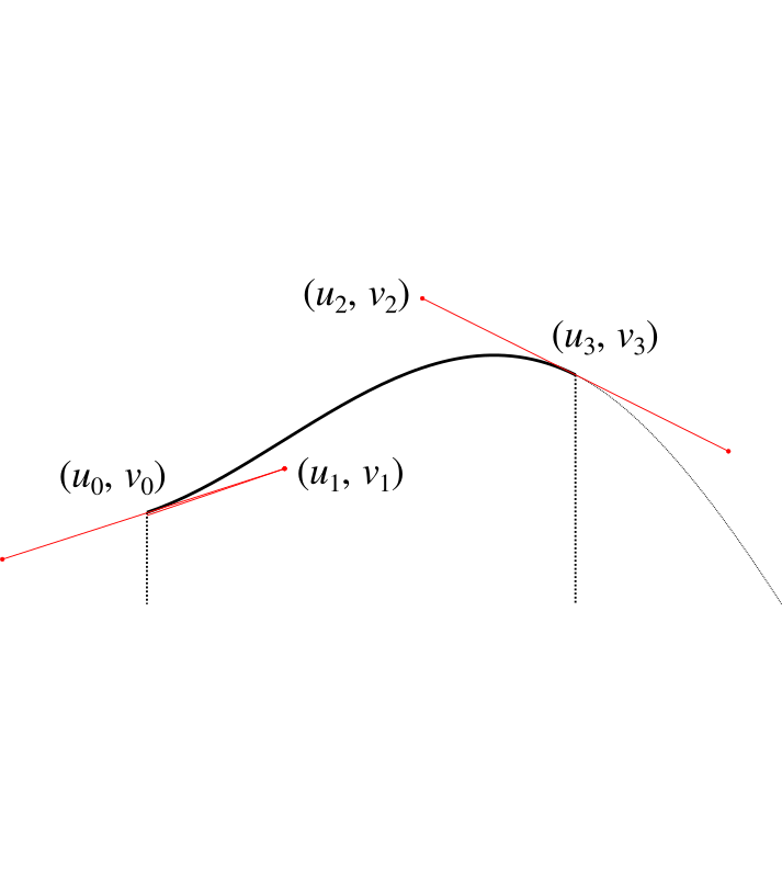
Now as before, we don't have control over $u_0$, $v_0$ because it affects the adjoining curve. We also don't have control over $u_1$ and $u_2$ because as just described, we have these set to allow us to perform the integration. We also must have $u_3$ set as $u_3 = u_0 + w / 2$ so that it's half way along the column.
Our initial assumption wil be that $v_3 = h$, but this is the value we're going to manipulate (i.e. raising or lowering the central point) in order to get the area we need. We shouldn't need to adjust it by much.
That just leaves $v_1$ and $v_2$. We need to choose these to give us a sensible and smooth curve, which introduces some additonal constraints. We'll set the gradient at the point $u_0$ to be the gradient $g_1$ of the line that connects the heights of the centrepoints of the two adjacent columns:
$$
g_1 = \frac{y - y_L}{x - x_L}
$$
where $x, y$ are the same points we discussed in part two, and $x_L, y_L$ are the same points for the column to the left. We'll also use $x_R, y_R$ to refer to the points for the column on the right, giving us:
$$
g_2 = \frac{y_R - y}{x_R - x} .
$$
Using our value for $g_1$ we then have
$$
v_1 = v_0 + g_1 (u_1 - u_0) .
$$
For the gradient $g$ at the centre of the column, we set this to be the gradient of the line between $y_1$ and $y_2$:
$$
g = \frac{y_2 - y_1}{x_2 - x_1} .
$$
We then have that
$$
v_2 = v_3 + g (u_2 - u_3) .
$$
From these we can calculate the area under the curve using the result from our integration calculation earlier, by simply substiuting the values in. After simplifying the result, we get the following.
$$
A_1' = \frac{1}{8}(x_2 - x_1) \left( 2y' + \frac{13}{6} y_1 - \frac{1}{6} y_2 + \frac{1}{6} g_1 (x_2 - x_1) \right)
$$
where $y'$ is the height of the central point which we'll adjust in order to get the area we need. This looks nasty, but it'll get simpler. We can perform the same calculation for the right hand side to get
$$
A_2' = \frac{1}{8}(x_2 - x_1) \left( 2y' + \frac{13}{6} y_2 - \frac{1}{6} y_1 - \frac{1}{6} g_2 (x_2 - x_1) \right) .
$$
Adding the two to give the total area $A' = A_1' + A_2'$ allows us to do a bunch of simplification, giving us
$$
A' = \frac{w}{2} \left( \frac{1}{2} y_1 + \frac{1}{2} y_2 + y' \right) + \frac{w^2}{48} (g_1 - g_2) .
$$
If we now compare this to the $A$ we calculated for the straight line graph in part two, subtracting one from the other gives us that
$$
y' = y + \frac{w}{24} (g_2 - g_1) .
$$
This tells us how much we have to adjust $y$ by to compensate for the area change caused by the curvature of the Bézier curves.
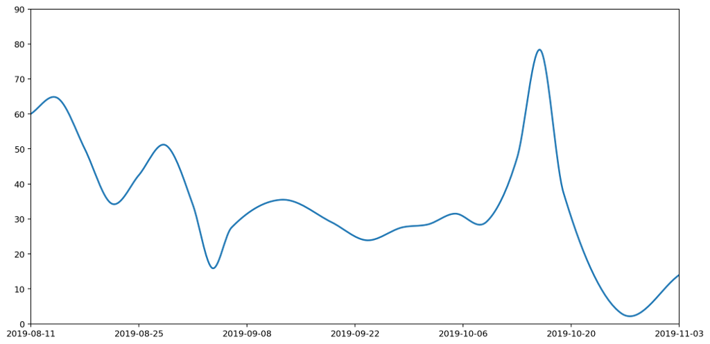
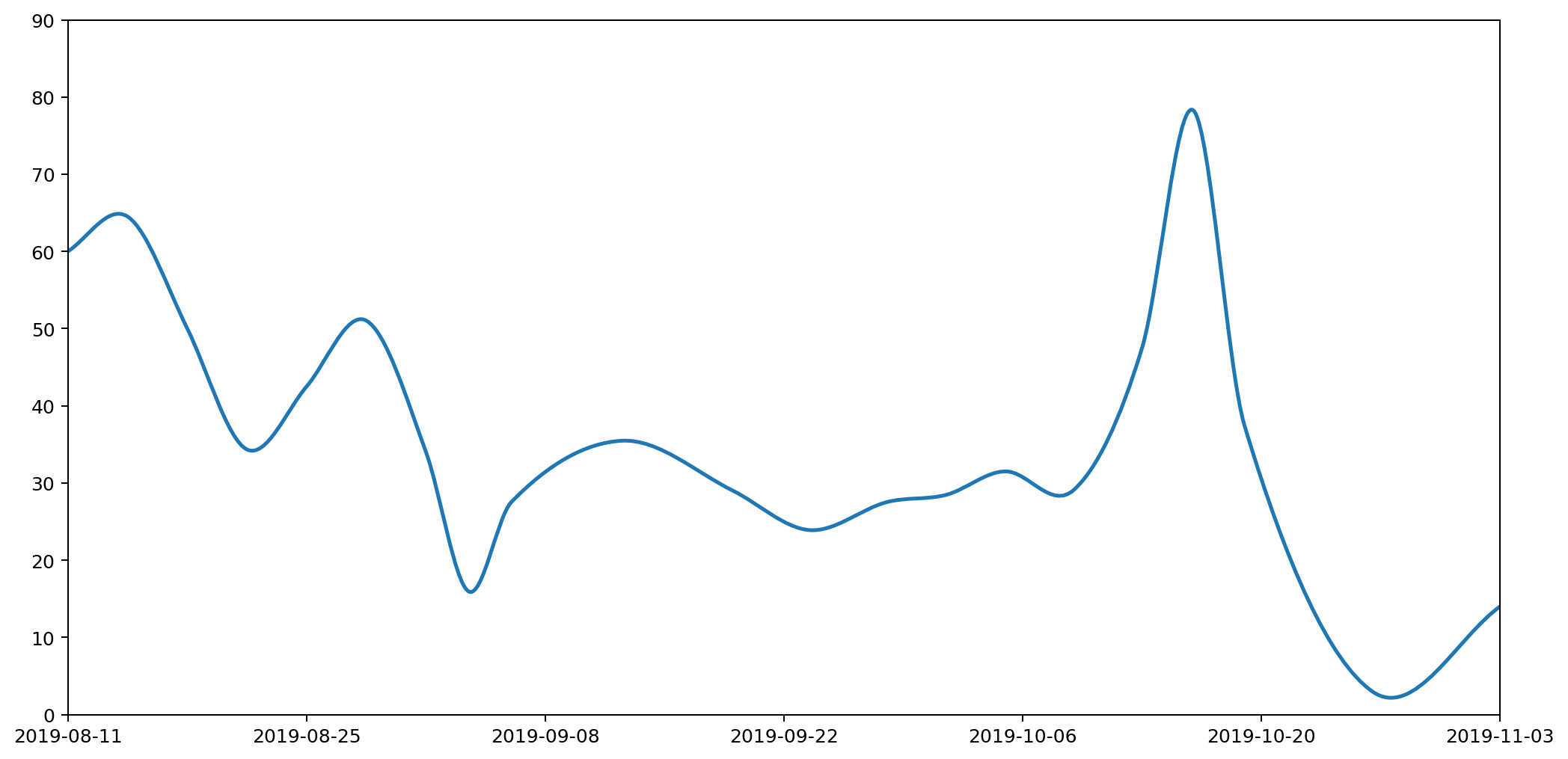
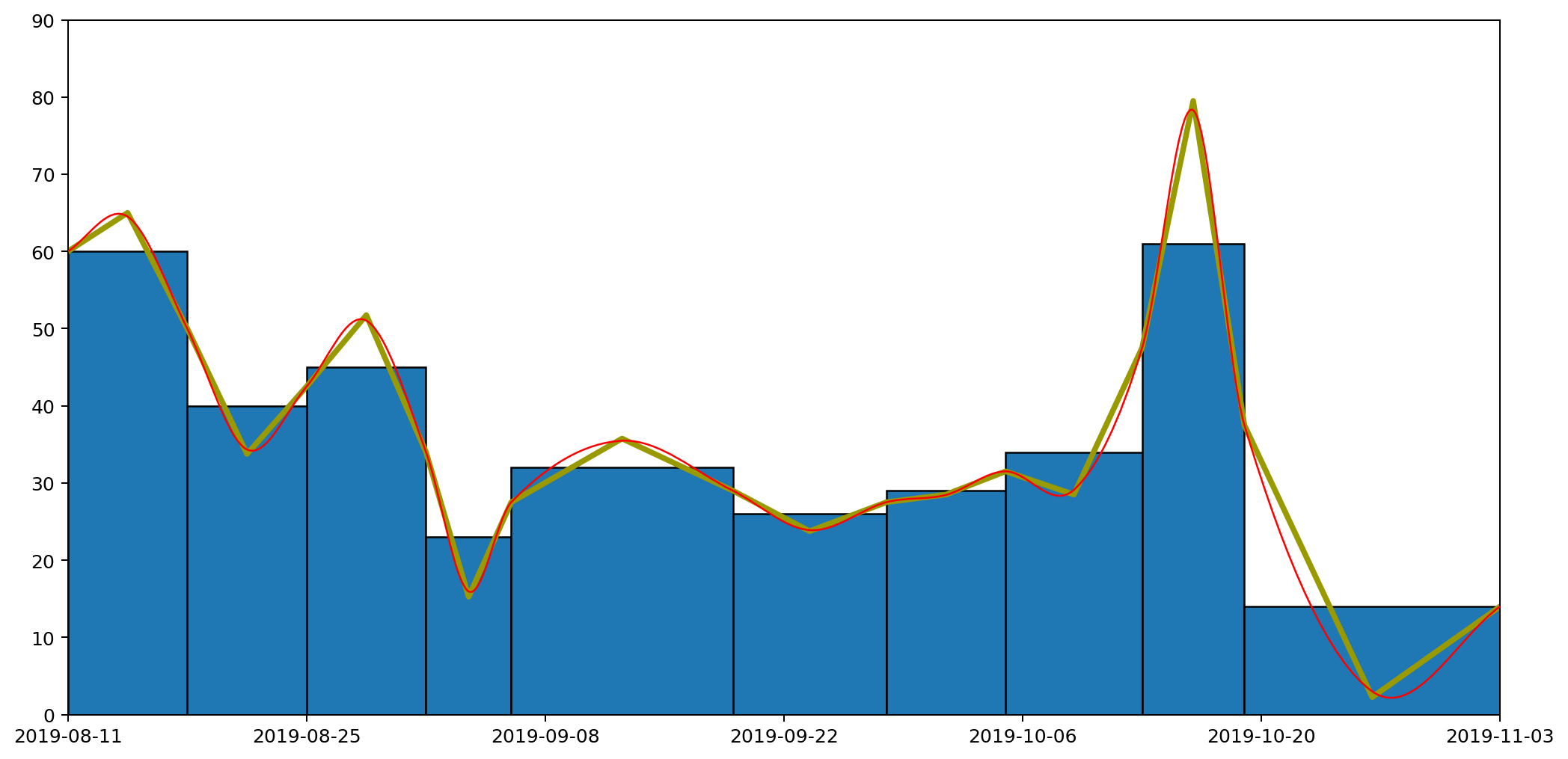
What does this give us in practice? Here's the new smoothed graph based on the same data as before.
Let's overlay the three approaches — histogram, straight line and curved graphs — to see how they all compare. The important thing to note is that the area under each of the columns — bounded above by the flat line, the straight line and the curve respectively — are all the same.

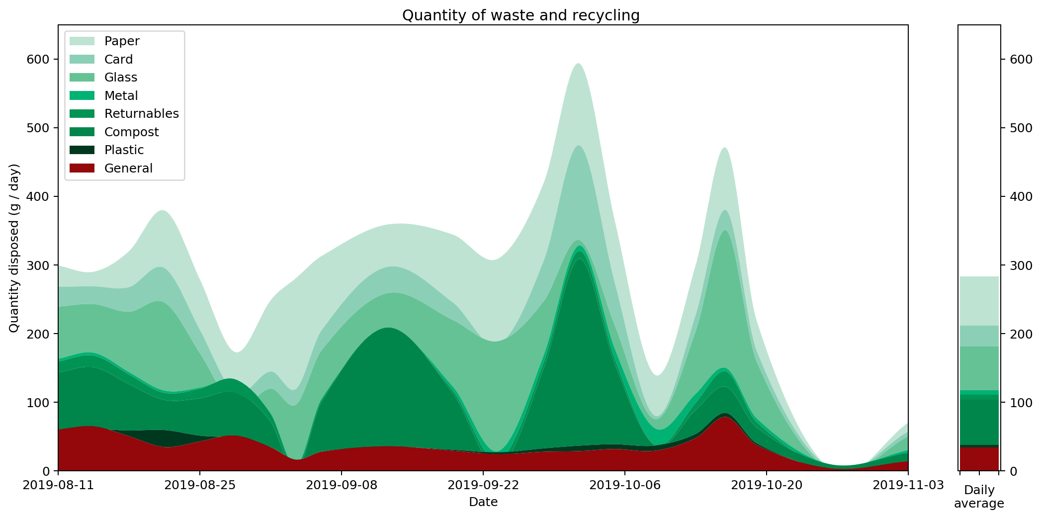
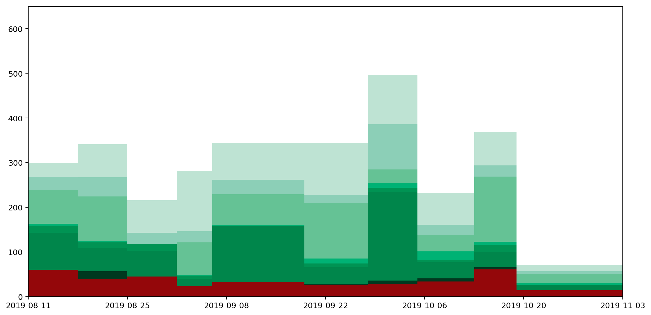
Because of the neat way Bézier curves retain their area properties, we can even stack them nicely, similarly to how we stacked our histogram in part one, to get the following representation of the full set of data.
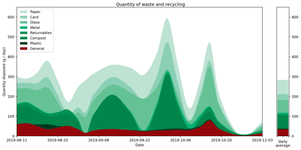
Putting all of this together, we now have a pretty straightforward way to present area-under-the-graph histograms of continuous data in a way that captures that continuity. I call this graph a "histocurve". A histocurve can give a clearer picture of the overall general trends of the data. For example, each of the strata in the histocurve remains unbroken, compared to the strata in a classic histogram which is liable to get broken at the boundary between every pair of columns.
That's all great, but it's certainly not perfect. In the fourth and final part of this series which I hope to get out on the 3rd December, I'll briefly discuss the pitfalls of histocurves, some of their negative properties, and things I'd love to fix but don't know how.
Comment
In part two we found out we could draw a continuous line graph that captured several useful properties that are usually associated with histograms, notably that the area under the line graph is the same as it would be for a histogram between the measurement points along the $x$-axis.
But what if we want to go a step further and draw a smooth line, rather than one made up of straight edges? Rather than just a continuous line, can we present the same data with a continuously differentiable line? Can we do this and still respect this 'area under the graph' property?
It turns out, the answer is "yes"! And we can do it in a similar way. First we send the curve through each of the same points at the boundary of each column, then we adjust the height of the midpoint to account for any changes caused by the curvature of the graph.
There are many, many, ways to draw nice curves, but one that frequently comes up in computing is the Bézier curve. It has several nice properties, in that it's nicely controllable, and depending on the order of the curve, we can control to any depth of derivative we choose. We'll use second-degree Bézier curves, meaning that we'll be able to have a continuous line and a continuous first derivative. This should keep things nice and smooth.
Bézier curves are defined parametrically, meaning that rather than having a function that takes an $x$ input and produces a $y$ output, as is the common Cartesian case, instead it takes a parameter input $t$ that falls between 0 and 1, and outputs both the $x$ and $y$ values. In order to avoid getting confused with the variables we used in part two, we're going to use $u$ and $v$ instead of $x$ and $y$ respectively.
Here's the formula for a second-order Bézier curve.
$$
\begin{pmatrix} u \\ v \end{pmatrix} = (1 - t)^3 \begin{pmatrix} u_0 \\ v_0 \end{pmatrix} + 3(1 - t)^2 t \begin{pmatrix} u_1 \\ v_1 \end{pmatrix} + 3 (1 - t) t^2 \begin{pmatrix} u_2 \\ v_2 \end{pmatrix} + t^3 \begin{pmatrix} u_3 \\ v_3 \end{pmatrix} .
$$
Where $\begin{pmatrix} u_0 \\ v_0 \end{pmatrix}$, $\begin{pmatrix} u_3 \\ v_3 \end{pmatrix}$ are the start and end points of the curve respectively, and $\begin{pmatrix} u _1\\ v_1 \end{pmatrix}$, $\begin{pmatrix} u_2 \\ v_2 \end{pmatrix}$ are control points that we position in order to get our desired curve.
The fact a Bézier curve is parametric is a problem for us, because it makes it considerably more difficult to integrate under the graph. If we want to know the area under the curve, we're going to have to integrate it, so we need a way to turn the parameterised curve into a Cartesian form.
Luckily we can cheat.
If we set $\begin{pmatrix} u_1 \\ v_1 \end{pmatrix}$ and $\begin{pmatrix} u_2 \\ v_2 \end{pmatrix}$ to be $\frac{1}{3}$ and $\frac{2}{3}$ of the way along the curve respectively, then things get considerably easier. In other words, set
\begin{align*}
u_1 & = u_0 + \frac{1}{3} (u_3 - u_0) \\
& = \frac{2}{3} u_0 + \frac{1}{3} u_3 \\
\end{align*}
and
\begin{align*}
u_2 & = u_0 + \frac{2}{3} (u_3 - u_0) \\
& = \frac{1}{3} u_0 + \frac{2}{3} u_3 .
\end{align*}
Substituting this into our Bézier curve equation from earlier we get
\begin{align*}
u & = (1 - t)^3 u_0 + 3 (1 - t)^2 t \times \left( \frac{2}{3} u_0 + \frac{1}{3} u_3 \right) + 3 (1 - t) t^2 \times \left( \frac{1}{3} u_0 + \frac{2}{3} u_3 \right) + t^3 u_3 \\
& = u_0 + t (u_3 - u_0) .
\end{align*}
When we choose our $u_1$ and $u_2$ like this, we can perform the substitution
$$
\psi(t) = u_0 + t(u_3 - u_0)
$$
in order to switch between $t$ and $u$. This will make the integral much easier to solve. We note that $\psi$ is a bijection and so invertible as long as $u_3 \not= u_0$. We can therefore define the inverse:
$$
t = \psi^{-1} (u) = \frac{u - u_0}{u_3 - u_0} \\
$$
It will also be helpful to do a bit of groundwork. We find the values at the boundary as
\begin{align*}
\psi^{-1} (u_0) & = 0, \\
\psi^{-1} (u_3) & = 1, \\
\end{align*}
and we also define the following for convenience.
$$
V(u) = v(\psi^{-1} (u)) .
$$
We'll use these in the calculation of the integral under the Bézier curve, which goes as follows.
$$
\int_{u_0}^{u_3} V(u) \mathrm{d}u
$$
Using the substitution rule we get
\begin{align*}
\int_{\psi^{-1}(u_0)}^{\psi^{-1}(u_3)} & V(\psi(t)) \psi'(t)\mathrm{d}t = \int_{t = 0}^{t = 1} v(\psi^{-1}(\psi(t))) (u_3 - u_0) \mathrm{d}t \\
& = (u_3 - u_0) \int_{0}^{1} v(t) \mathrm{d}t . \\
& = (u_3 - u_0) \int_{0}^{1} (1 - t)^3 v_0 + 3 (1 - t)^2 t v_1 + 3 (1 - t) t^2 v_2 + t^3 v_3 \mathrm{d}t \\
& = (u_3 - u_0) \int_{0}^{1} (1 - 3t + 3t^2 - t^3) v_0 + 3 (t - 2t^2 + t^3) v_1 + 3 (t^2 - t^3) v_2 + t^3 v_3 \mathrm{d}t \\
& = \frac{1}{4} (u_3 - u_0) (v_0 + v_1 + v_2 + v_3) .
\end{align*}
We'll bank this calculation and come back to it. Let's now consider how we can wrap the Bézier curve over the points in our graph to make a nice curve. For each column we're going to end up with something like this.
Now as before, we don't have control over $u_0$, $v_0$ because it affects the adjoining curve. We also don't have control over $u_1$ and $u_2$ because as just described, we have these set to allow us to perform the integration. We also must have $u_3$ set as $u_3 = u_0 + w / 2$ so that it's half way along the column.
Our initial assumption wil be that $v_3 = h$, but this is the value we're going to manipulate (i.e. raising or lowering the central point) in order to get the area we need. We shouldn't need to adjust it by much.
That just leaves $v_1$ and $v_2$. We need to choose these to give us a sensible and smooth curve, which introduces some additonal constraints. We'll set the gradient at the point $u_0$ to be the gradient $g_1$ of the line that connects the heights of the centrepoints of the two adjacent columns:
$$
g_1 = \frac{y - y_L}{x - x_L}
$$
where $x, y$ are the same points we discussed in part two, and $x_L, y_L$ are the same points for the column to the left. We'll also use $x_R, y_R$ to refer to the points for the column on the right, giving us:
$$
g_2 = \frac{y_R - y}{x_R - x} .
$$
Using our value for $g_1$ we then have
$$
v_1 = v_0 + g_1 (u_1 - u_0) .
$$
For the gradient $g$ at the centre of the column, we set this to be the gradient of the line between $y_1$ and $y_2$:
$$
g = \frac{y_2 - y_1}{x_2 - x_1} .
$$
We then have that
$$
v_2 = v_3 + g (u_2 - u_3) .
$$
From these we can calculate the area under the curve using the result from our integration calculation earlier, by simply substiuting the values in. After simplifying the result, we get the following.
$$
A_1' = \frac{1}{8}(x_2 - x_1) \left( 2y' + \frac{13}{6} y_1 - \frac{1}{6} y_2 + \frac{1}{6} g_1 (x_2 - x_1) \right)
$$
where $y'$ is the height of the central point which we'll adjust in order to get the area we need. This looks nasty, but it'll get simpler. We can perform the same calculation for the right hand side to get
$$
A_2' = \frac{1}{8}(x_2 - x_1) \left( 2y' + \frac{13}{6} y_2 - \frac{1}{6} y_1 - \frac{1}{6} g_2 (x_2 - x_1) \right) .
$$
Adding the two to give the total area $A' = A_1' + A_2'$ allows us to do a bunch of simplification, giving us
$$
A' = \frac{w}{2} \left( \frac{1}{2} y_1 + \frac{1}{2} y_2 + y' \right) + \frac{w^2}{48} (g_1 - g_2) .
$$
If we now compare this to the $A$ we calculated for the straight line graph in part two, subtracting one from the other gives us that
$$
y' = y + \frac{w}{24} (g_2 - g_1) .
$$
This tells us how much we have to adjust $y$ by to compensate for the area change caused by the curvature of the Bézier curves.
What does this give us in practice? Here's the new smoothed graph based on the same data as before.
Let's overlay the three approaches — histogram, straight line and curved graphs — to see how they all compare. The important thing to note is that the area under each of the columns — bounded above by the flat line, the straight line and the curve respectively — are all the same.
Because of the neat way Bézier curves retain their area properties, we can even stack them nicely, similarly to how we stacked our histogram in part one, to get the following representation of the full set of data.
Putting all of this together, we now have a pretty straightforward way to present area-under-the-graph histograms of continuous data in a way that captures that continuity. I call this graph a "histocurve". A histocurve can give a clearer picture of the overall general trends of the data. For example, each of the strata in the histocurve remains unbroken, compared to the strata in a classic histogram which is liable to get broken at the boundary between every pair of columns.
That's all great, but it's certainly not perfect. In the fourth and final part of this series which I hope to get out on the 3rd December, I'll briefly discuss the pitfalls of histocurves, some of their negative properties, and things I'd love to fix but don't know how.
26 Nov 2019 : Graphs of Waste, Part 3 #
The third part in my series on histograms is now available on my blog, entitled "A Continuously Differentiable Histogram Approach". In it we take a look at now to create a curved histogram (a histocurve!) to replace the column and line based approaches from parts 1 and 2.
24 Nov 2019 : Waste data #
New waste data is up on my waste page. It seems to have been a pretty average week this week, in spite of me having to throw away a heavy dose of my unpleasant Turkish Delight ("Turkish Disgust"?). Slightly below average with paper down (due to the postal strike in Finland). General waste is down and plastic is up, but mostly because I'm getting better at sorting them: combined they're about average. Don't forget if this is somehow interesting to you, you might find the series on drawing these waste graphs interesting. Part 1 and part 2 are up on my blog.
19 Nov 2019 : Graphs of Waste, Part 2: A Continuous Histogram Approach #
In part one we looked at how graphs can be a great tool for expressing the generalities in specific datasets, but how even seemingly minor changes in the choice of graphing technique can result in a graph that tells an inaccurate story.
We finished by looking at how a histogram would be a good choice for representing the particular type of data I've been collecting, to express the quantity of various types of waste (measured by weight) as the area under the graph. Here's the example data plotted as a histogram.
While this is good at presenting the general picture, I really want to also express how my waste generation is part of a continuous process. In the very first graph I generated to try to understand my waste output, I drew the datapoints and joined them with lines. This wasn't totally crazy as it highlighted the trends over time. However, it gave completely the wrong impression because the area under the graph bore no relation to the amount of waste I produced.
How can we achieve both? Show a continuous change of the data by joining datapoints with lines, while also ensuring the area under the graph represents the actual amount of waste produced?
The histogram above achieves the goal of having the area under the graph represent the all-important quantities captured by the data clearly visible in the graph. But it doesn't express the continuous nature of the data.
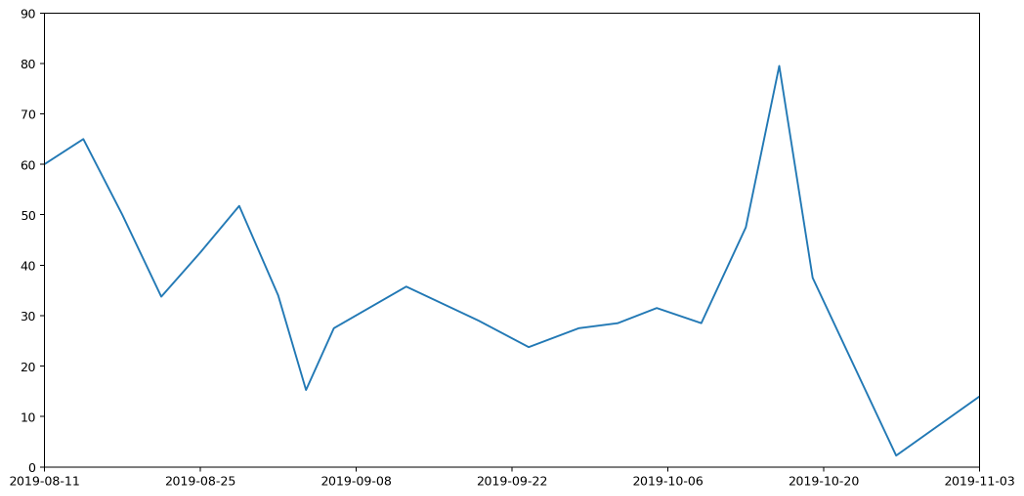
Contrariwise, if we were to take the point at the top of each histogram column and join them up, we'd have a continuous line across the graph, but the area underneath would no longer represent useful data.
If we want to capture a `middle ground' between the two, it's helpful to apply some additional constraints.
To do this, we'll adjust the position of the datapoints for each of the readings and introduce a new point in between every pair of existing datapoints as follows.
Following these rules we end up with something like this.
This gives us our continuous line, but as you can see from the diagram, for each column the area under the line doesn't necessarily represent the quantity captured by the data. We can see this more easily by focussing in on one of the columns. The hatched area in the picture below shows area that used to be included, but which would be removed if we drew our line like this, making the area under the line for this particular region less than it should be.
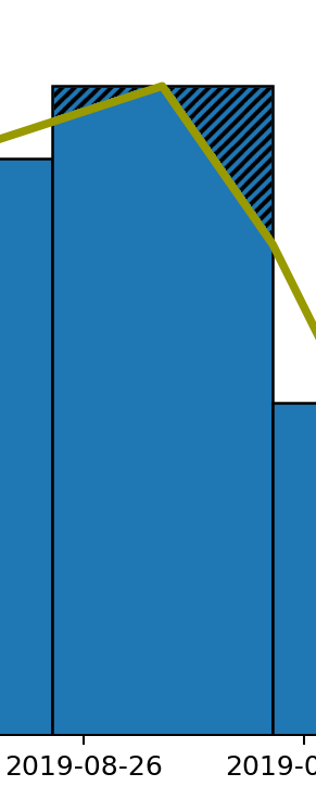
Across the entire width of these graphs the additions might cancel out the subtractions, but that's not guaranteed, and it also fails our second requirement that the area under the line should be the same as the area under the histogram column for each column individually.
To address this we can adjust the position of the point in the centre of each column by altering its height to capture the correct amount of area. In the case shown above, we'd need to move the point higher because we've cut off some of the area and need to get it back. In other cases we may need to reduce the height of the point to remove area that we over-captured.

 To calculate the exact height of the central point, we can use the following formula.
$$ y = 2h - \frac{1}{2} (y_1 + y_2) .
$$
The area $A = A_1 + A_2 + A_3 + A_4$ under the curve can then be calculated as follows.
\begin{align*} A & = \left( \frac{w}{2} \times y_1 \right) + \left( \frac{w}{2} \times y_2 \right) + \left( \frac{1}{2} \times \frac{w}{2} \times (y - y_1) \right) + \left( \frac{1}{2} \times \frac{w}{2} \times (y - y_3) \right) \\ & = \frac{w}{2} \left( \frac{1}{2} y_1 + \frac{1}{2} y_2 + y \right) . \\ \end{align*}
Substituting $y$ into this we get the following.
\begin{align*} A & = \frac{w}{2} \left( \frac{1}{2} y_1 + \frac{1}{2} y_2 + 2h - \frac{1}{2} y_1 - \frac{1}{2} y_2 \right) \\ & = wh. \end{align*}
Which is the area of the column as required.
Following this approach we end up with a graph like this.
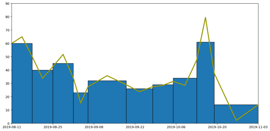
Which taken on its own gives a clear idea of the trend over time, while still capturing the overall quantity of waste produced in each period as the area under the graph.
In the next part we'll look at how we can refine this further by rendering a smooth curve, rather than straight lines, but in a way that retains the same properties we've been requiring here.
All of the graphs here were produced using the superb MatPlotLib and the equations rendered using MathJax (the first time I'm using it, and it looks like it's done a decent job).
Comment
We finished by looking at how a histogram would be a good choice for representing the particular type of data I've been collecting, to express the quantity of various types of waste (measured by weight) as the area under the graph. Here's the example data plotted as a histogram.
While this is good at presenting the general picture, I really want to also express how my waste generation is part of a continuous process. In the very first graph I generated to try to understand my waste output, I drew the datapoints and joined them with lines. This wasn't totally crazy as it highlighted the trends over time. However, it gave completely the wrong impression because the area under the graph bore no relation to the amount of waste I produced.
How can we achieve both? Show a continuous change of the data by joining datapoints with lines, while also ensuring the area under the graph represents the actual amount of waste produced?
The histogram above achieves the goal of having the area under the graph represent the all-important quantities captured by the data clearly visible in the graph. But it doesn't express the continuous nature of the data.
Contrariwise, if we were to take the point at the top of each histogram column and join them up, we'd have a continuous line across the graph, but the area underneath would no longer represent useful data.
If we want to capture a `middle ground' between the two, it's helpful to apply some additional constraints.
- The line representing the weights should be continuous.
- The area under the line should be the same as the area under the histogram column for each column individually.
- For each reading, the line can be affected by the readings either side (this is inevitable if the constraint 1 is going to be enforced), but should be independent of anything further away.
To do this, we'll adjust the position of the datapoints for each of the readings and introduce a new point in between every pair of existing datapoints as follows.
- Start with the datapoints positioned to be horizontally centred in each column and taken as the height of the histogram column that encloses it.
- For every pair of datapoints A and B, place an additional point at the boundary of the columns for A and B, and with y value set as the average between the two columns A and B.
Following these rules we end up with something like this.

This gives us our continuous line, but as you can see from the diagram, for each column the area under the line doesn't necessarily represent the quantity captured by the data. We can see this more easily by focussing in on one of the columns. The hatched area in the picture below shows area that used to be included, but which would be removed if we drew our line like this, making the area under the line for this particular region less than it should be.
Across the entire width of these graphs the additions might cancel out the subtractions, but that's not guaranteed, and it also fails our second requirement that the area under the line should be the same as the area under the histogram column for each column individually.
To address this we can adjust the position of the point in the centre of each column by altering its height to capture the correct amount of area. In the case shown above, we'd need to move the point higher because we've cut off some of the area and need to get it back. In other cases we may need to reduce the height of the point to remove area that we over-captured.
$$ y = 2h - \frac{1}{2} (y_1 + y_2) .
$$
The area $A = A_1 + A_2 + A_3 + A_4$ under the curve can then be calculated as follows.
\begin{align*} A & = \left( \frac{w}{2} \times y_1 \right) + \left( \frac{w}{2} \times y_2 \right) + \left( \frac{1}{2} \times \frac{w}{2} \times (y - y_1) \right) + \left( \frac{1}{2} \times \frac{w}{2} \times (y - y_3) \right) \\ & = \frac{w}{2} \left( \frac{1}{2} y_1 + \frac{1}{2} y_2 + y \right) . \\ \end{align*}
Substituting $y$ into this we get the following.
\begin{align*} A & = \frac{w}{2} \left( \frac{1}{2} y_1 + \frac{1}{2} y_2 + 2h - \frac{1}{2} y_1 - \frac{1}{2} y_2 \right) \\ & = wh. \end{align*}
Which is the area of the column as required.
Following this approach we end up with a graph like this.

Which taken on its own gives a clear idea of the trend over time, while still capturing the overall quantity of waste produced in each period as the area under the graph.
In the next part we'll look at how we can refine this further by rendering a smooth curve, rather than straight lines, but in a way that retains the same properties we've been requiring here.
All of the graphs here were produced using the superb MatPlotLib and the equations rendered using MathJax (the first time I'm using it, and it looks like it's done a decent job).
19 Nov 2019 : Graphs of Waste, Part 2 #
Part 2 of my series on embellishing histograms is now up on my blog. This post discusses a "continuous histogram" visualisation. It discusses how can you take data that accumulates over time that might usually be presented in a histogram, but instead render it using a continuous line without misrepresenting the data.
16 Nov 2019 : Waste data #
I've added another week's worth of data about my waste and recycling to the waste page. I made the mistake of trying to make Turkish Delight again this week (sadly still without any decent results). So, lots of grapefruit skins weighing down the compost. More concerning is that my general waste — the most damaging category — is up on last week by a big margin. It sounds terrible, but most of that was because I've been suffering from a bad cold and went through several packs of tissues (in Finland they come in packs, not boxes). Nobody benefitted from that! If you're taking an interest in my waste output, you might also be interested in my series of posts about the waste graphs I'm using. Part 1 is on my blog.
12 Nov 2019 : Graphs of Waste, Part 1 #
Over the next four weeks I'll be posting a series of articles on my blog about how I'm improving the graph on my waste page. The current graph is bad and needs fixing, and in the articles I plan to describe how. The first part entitled "Choose Your Graph Wisely" is now up on my blog.
12 Nov 2019 : Graphs of Waste, Part 1: Choose Your Graph Wisely #
I have to admit I'm a bit of a data visualisation pedant. If I see data presented in a graph, I want the type of graph chosen to match the expressive aim of the visualisation. A graph should always aim to expose some underlying aspect of the data that would be hard to discern just by looking at the data in a table. Getting this right means first and foremost choosing the correct modality, but beyond that the details are important too: colours, line thicknesses, axis formats, labels, marker styles. All of these things need careful consideration.
You may think this is all self-evident, and that anyone taking the trouble to plot data in a graph will obviously have taken these things into account, but sadly it's rarely the case. I see data visualisation abominations on a daily basis. What's more it's often the people you'd expect to be best at it who turn out to fall into the worst traps. Over fifteen years of reviewing academic papers in computer science, I've seen numerous examples of terrible data visualisation. These papers are written by people who have both access to and competence in the best visualisation tooling, and who presumably have a background in analytical thinking, and yet graphs presented in papers often fail the most basic requirements. It's not unusual to see graphs that are too small to read, with unlabelled axes, missing units, use of colour in greyscale publications, or with continuous lines drawn between unrelated discrete data points.
And that's without even mentioning pseudo-3D projections or spider graphs.
One day I'll take the time to write up some of these data visualisation horror stories, but right now I want to focus on one of my own infractions. I'll warn you up front that it's not a pretty story, but I'm hoping it will have a happy ending. I'm going to talk about how I created a most terrible graph, and how I've attempted to redeem myself by developing what I believe is a much clearer representation of the data.
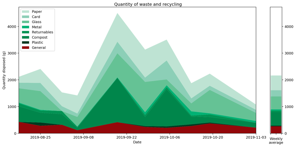
Over the last couple of months I've been collecting data on how much waste and recycling I generate. Broadly speaking this is for environmental and motivational reasons: I believe that if I make myself more aware of how much rubbish I'm producing, it'll motivate me to find ways to reduce it, and also help me understand where my main areas for improvement are. If I'm honest I don't expect it'll work (many years ago I was given a device for measuring real-time electricity usage with a similar aim and I can't say that succeeded), but for now it's important to understand my motivations. It goes to the heart of what makes a good graphing choice.
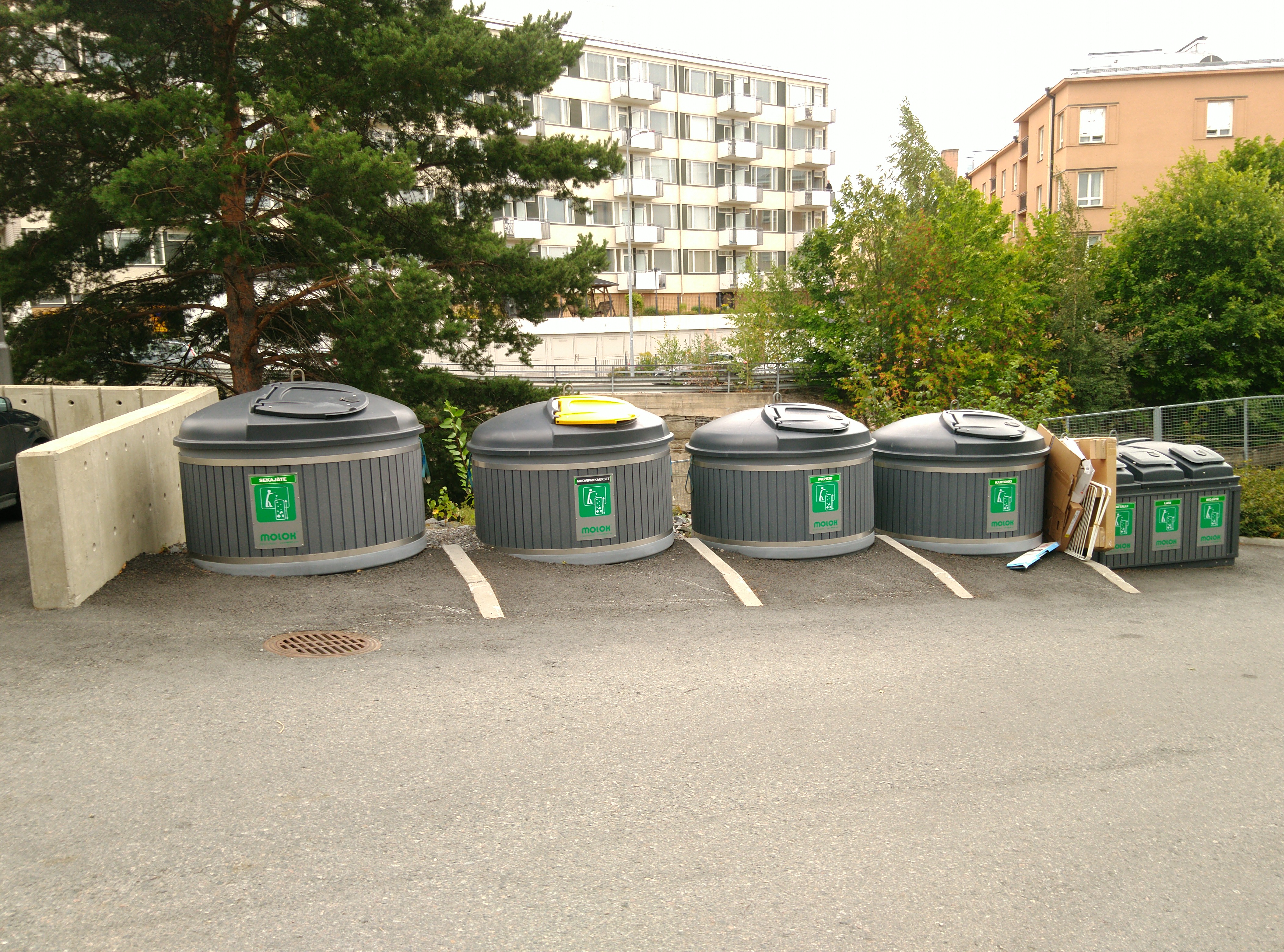
So, each week I weigh my rubbish using kitchen scales, categorised into different types matching the seven different recycling bins provided for use in my apartment complex.
Here's the data I've collected until now presented in a table.
We can't tell a great deal from this table. We can certainly read off the measurements very easily and accurately, but beyond that the table fails to give any sort of overall picture or idea of trends.
The obvious thing to do is therefore to draw a graph and hope to tease out something that way. So, here's the graph I came up with, and which I've had posted and updated on my website for a couple of months.
What does this graph show? Well, to be precise, it's a stacked plot of the weight measurements against the dates the measurements were taken. It gives a pretty clear picture of how much waste I produced over a period of time. We can see that my waste output increased and peaked before falling again, and that this was mostly driven by changes in the weight of compost I produced.
Or does it? In fact, as the data accumulated on the graph, it became increasingly clear that this is a misleading visualisation. Even though it's an accurate plot of the measurements taken, it gives completely the wrong idea about how much waste I've been generating.
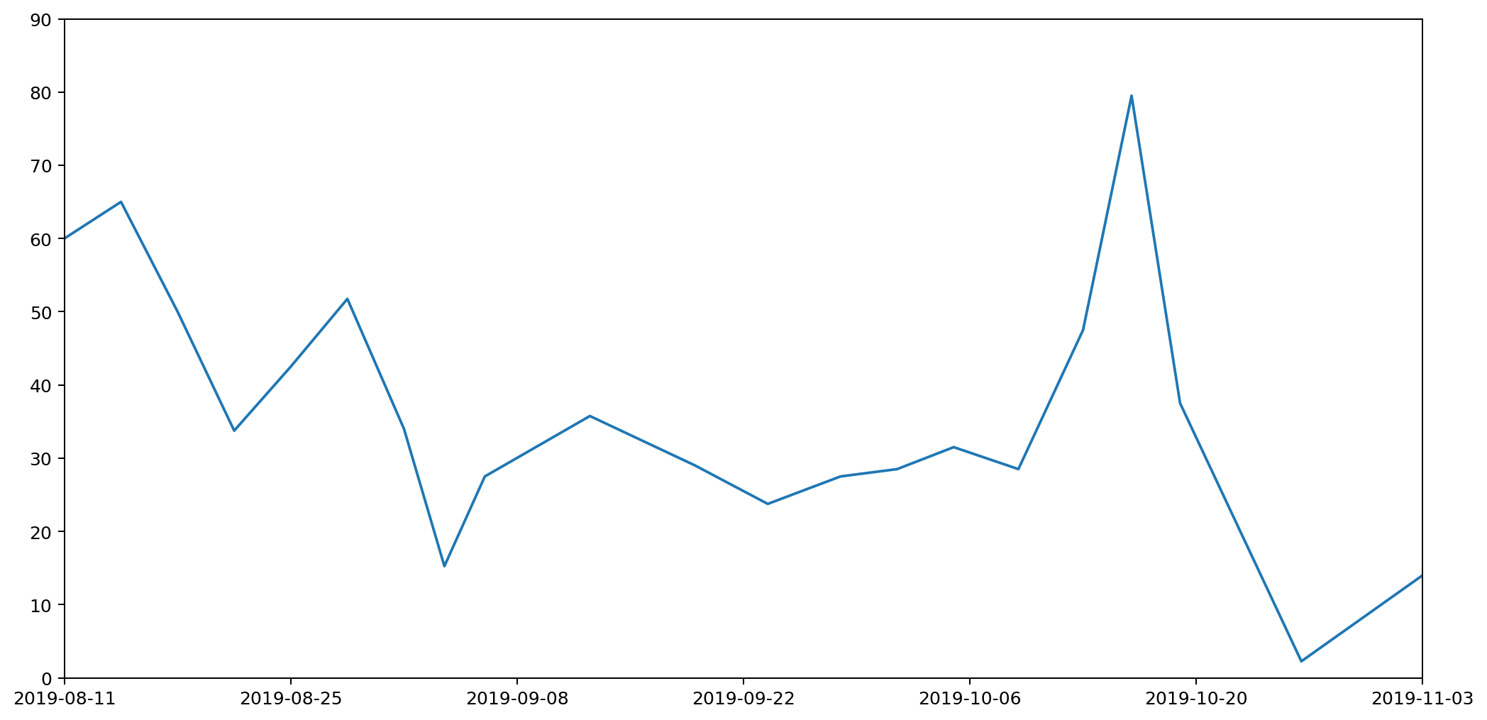
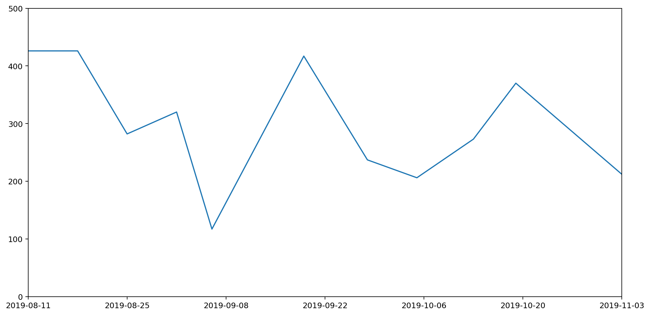
To understand this better, let's consider just one of the stacked plots. The red area down at the base is showing the measurements I took for general waste. Here's another graph that shows the same data isolated from the other types of waste and plotted on a more appropriate scale.
If you're really paying attention you'll notice that the start date on this second graph is different to that of the first. That's because the very first datapoint represents my waste output for the seven days prior to the reading, and we'll need those extra seven days for comparison with some of the other plots we'll be looking at shortly.
There are several things wrong with this plot, but the most serious issue, the one I want to focus on, is that it gives a completely misleading impression of how much waste I've been generating. That's because the most natural way to interpret this graph would be to read off the value for any given day and assume that's how much waste was generated that day. This would leave the area under the graph being the total amount of waste output. In fact the lines simply connect different data points. The actual datapoints themselves don't represent the amount of waste generated in a day, but in fact the amount generated in a week. And because I don't always take my measurements at the same time each week, they don't even represent a week's worth of rubbish. To find out the daily waste generated, I'd need to divide a specific reading by the number of days since the last reading.
Take for example the measurements taken on the 6th September. I usually weight my rubbish on a Saturday, but because I went on holiday on the 7th I had to do the weighing a day early. Then I was away from home for seven days, came back and didn't then weight my rubbish again until the 19th, nearly two weeks later.
Although I spent a chunk of this time away, it still meant that the reading was high, making it look as if I'd generated a lot of waste over the two-week period. In fact, considering this was double the time of the usual readings, it was actually a relatively low reading. This should be reflected in the graph, but it's not. It looks like I generated more rubbish than expected; in fact I generated less.
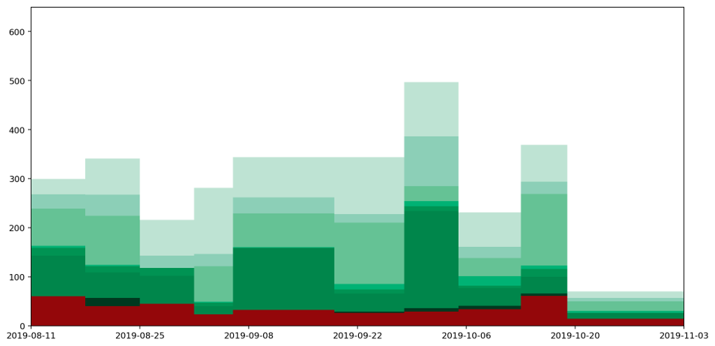
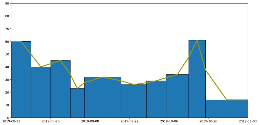
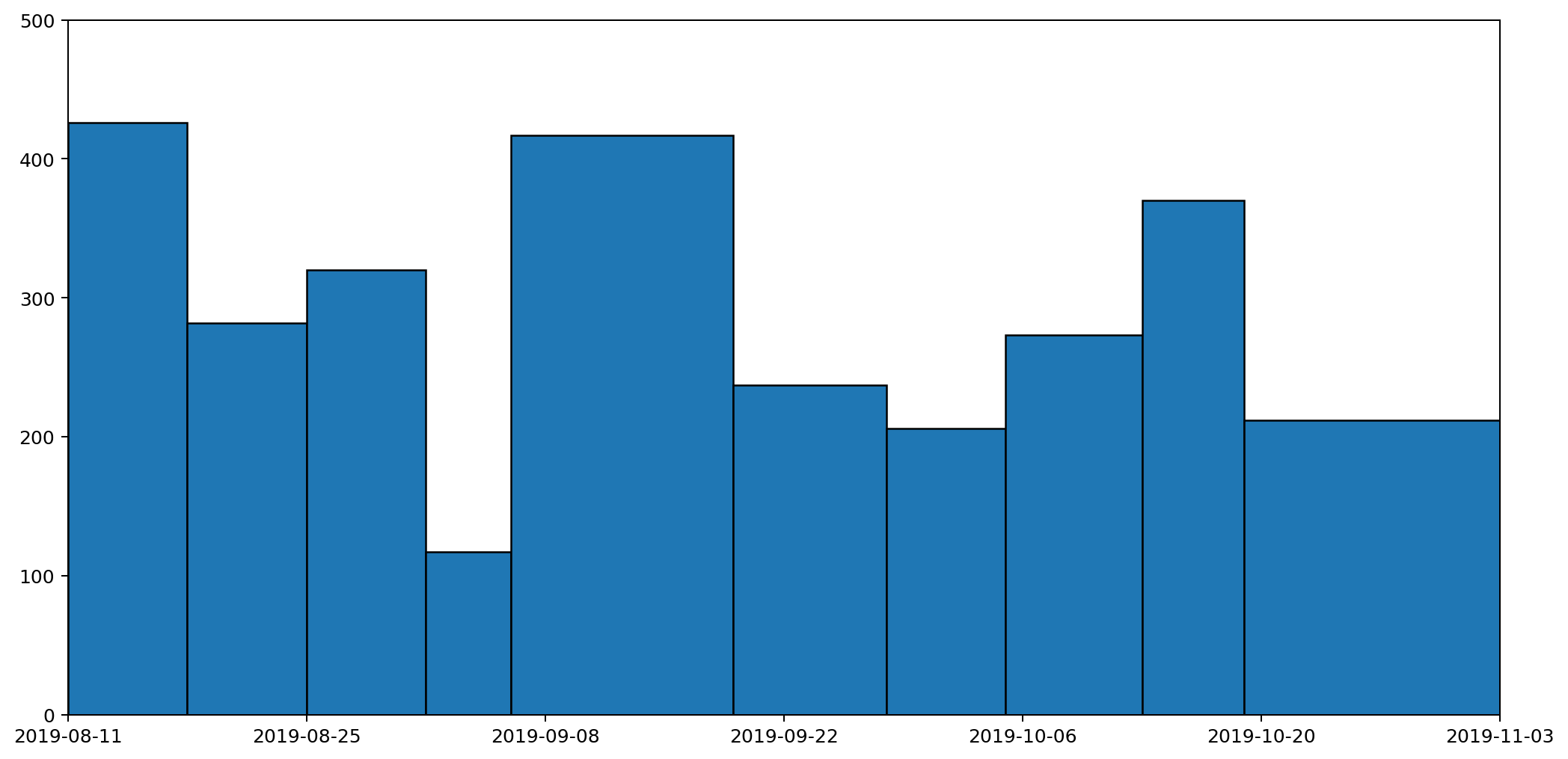
We can see this more clearly if we plot the data as a column (bar) graph and as a histogram. Here's the column graph first.
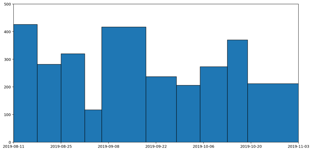
These are the same datapoints as in the previous graph, but drawn as columns with widths proportional to the duration that the readings represent. The column that spreads across from the 6th to the 19th September is the reading we've just been discussing. This is a tall, wide, column because it represents a long period (nearly two weeks) and a heaver than usual weight reading (because it's more than a weeks' worth of rubbish). If we now convert this into a histogram, it'll give us a clearer picture of how much waste was being generated per day.
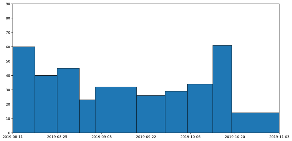
This histogram takes each of the columns and divides it by the number of days the column represents. A histogram has the nice property that the area — rather than the height — of a column represents the value being plotted. In this histogram, the area under all of the columns represents the quantity of waste that I've generated across the entire period: the more blue, the more waste.
Not only is this a much clearer representation, it also completely changes the picture. The original graph made it look like my waste output peaked in the middle. There is a slight rise in the middle, but it's actually just a local maximum. In fact the overall trend was that my daily general waste output was decreasing until the middle of the period, and then rose slightly over time. That's a much more accurate reflection of what actually happened.
It would be possible to render the data as a stacked histogram, and to be honest I'd be happy with that. The overall picture, which ties in with my motivation for wanting the graph in the first place, indicates how much waste I'm generating based on the area under the graph.
But in fact I tend to be generating small bits of rubbish throughout the week, and I'd like to see the trend between readings, so it would be reasonable to draw a line between weeks rather than have them as histogram blocks or columns.
So this leads us down the path of how we might draw a graph that captures these trends, but still also retains the nice property that the area under the graph represents the amount of waste produced.
That's what I'll be exploring in part two.
All of the graphs here were generated using the superb MatPlotLib.
Comment
You may think this is all self-evident, and that anyone taking the trouble to plot data in a graph will obviously have taken these things into account, but sadly it's rarely the case. I see data visualisation abominations on a daily basis. What's more it's often the people you'd expect to be best at it who turn out to fall into the worst traps. Over fifteen years of reviewing academic papers in computer science, I've seen numerous examples of terrible data visualisation. These papers are written by people who have both access to and competence in the best visualisation tooling, and who presumably have a background in analytical thinking, and yet graphs presented in papers often fail the most basic requirements. It's not unusual to see graphs that are too small to read, with unlabelled axes, missing units, use of colour in greyscale publications, or with continuous lines drawn between unrelated discrete data points.
And that's without even mentioning pseudo-3D projections or spider graphs.
One day I'll take the time to write up some of these data visualisation horror stories, but right now I want to focus on one of my own infractions. I'll warn you up front that it's not a pretty story, but I'm hoping it will have a happy ending. I'm going to talk about how I created a most terrible graph, and how I've attempted to redeem myself by developing what I believe is a much clearer representation of the data.
Over the last couple of months I've been collecting data on how much waste and recycling I generate. Broadly speaking this is for environmental and motivational reasons: I believe that if I make myself more aware of how much rubbish I'm producing, it'll motivate me to find ways to reduce it, and also help me understand where my main areas for improvement are. If I'm honest I don't expect it'll work (many years ago I was given a device for measuring real-time electricity usage with a similar aim and I can't say that succeeded), but for now it's important to understand my motivations. It goes to the heart of what makes a good graphing choice.
So, each week I weigh my rubbish using kitchen scales, categorised into different types matching the seven different recycling bins provided for use in my apartment complex.
Here's the data I've collected until now presented in a table.
| Date | Paper | Card | Glass | Metal | Returnables | Compost | Plastic | General |
|---|---|---|---|---|---|---|---|---|
| 18/08/19 | 221 | 208 | 534 | 28 | 114 | 584 | 0 | 426 |
| 25/08/19 | 523 | 304 | 702 | 24 | 85 | 365 | 123 | 282 |
| 01/09/19 | 517 | 180 | 0 | 0 | 115 | 400 | 0 | 320 |
| 06/09/19 | 676 | 127 | 360 | 14 | 36 | 87 | 0 | 117 |
| 19/09/19 | 1076 | 429 | 904 | 16 | 0 | 1661 | 0 | 417 |
| 28/09/19 | 1047 | 162 | 1133 | 105 | 74 | 341 | 34 | 237 |
| 05/10/19 | 781 | 708 | 218 | 73 | 76 | 1391 | 54 | 206 |
| 13/10/19 | 567 | 186 | 299 | 158 | 40 | 289 | 63 | 273 |
We can't tell a great deal from this table. We can certainly read off the measurements very easily and accurately, but beyond that the table fails to give any sort of overall picture or idea of trends.
The obvious thing to do is therefore to draw a graph and hope to tease out something that way. So, here's the graph I came up with, and which I've had posted and updated on my website for a couple of months.
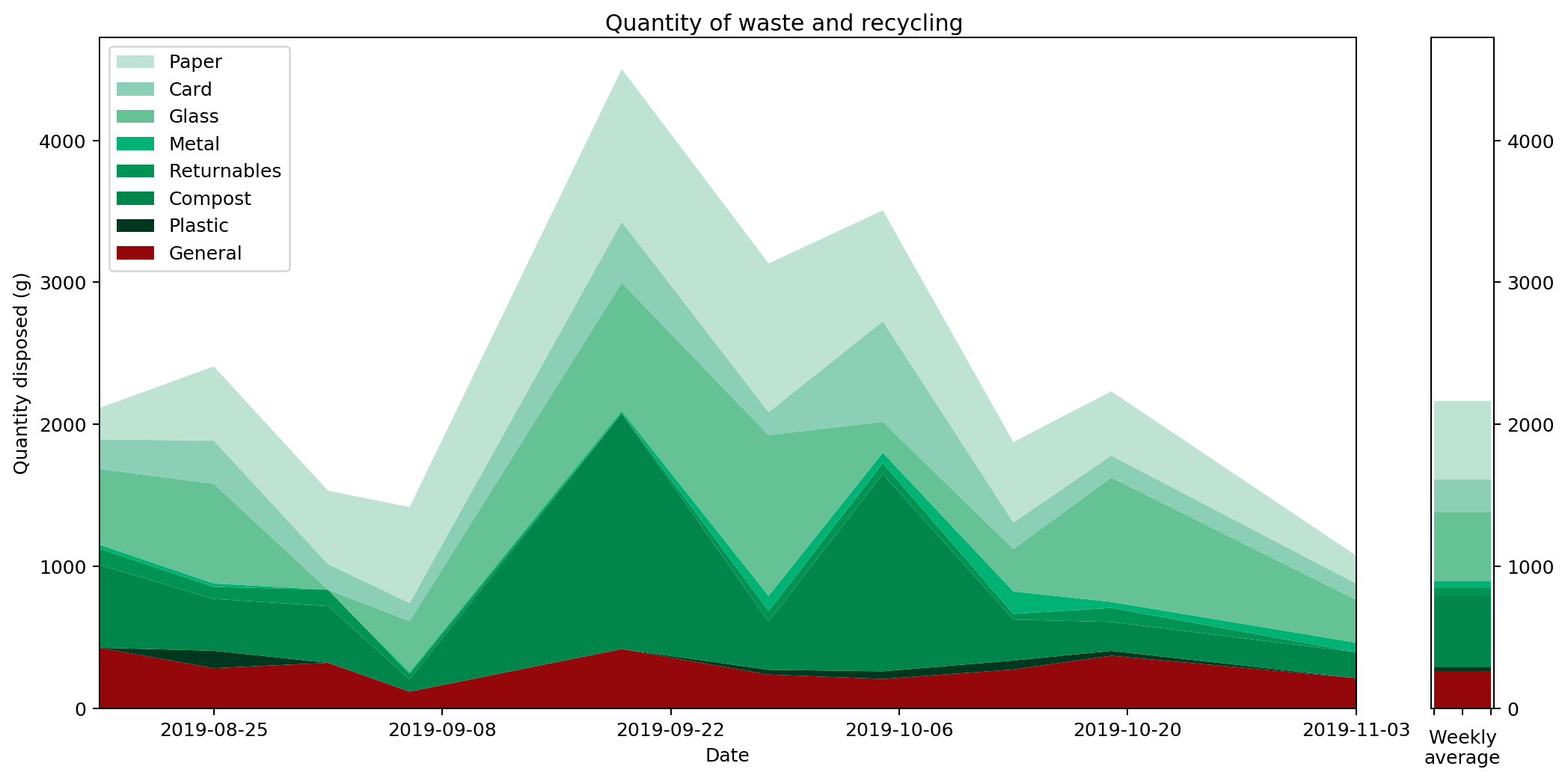
What does this graph show? Well, to be precise, it's a stacked plot of the weight measurements against the dates the measurements were taken. It gives a pretty clear picture of how much waste I produced over a period of time. We can see that my waste output increased and peaked before falling again, and that this was mostly driven by changes in the weight of compost I produced.
Or does it? In fact, as the data accumulated on the graph, it became increasingly clear that this is a misleading visualisation. Even though it's an accurate plot of the measurements taken, it gives completely the wrong idea about how much waste I've been generating.
To understand this better, let's consider just one of the stacked plots. The red area down at the base is showing the measurements I took for general waste. Here's another graph that shows the same data isolated from the other types of waste and plotted on a more appropriate scale.
If you're really paying attention you'll notice that the start date on this second graph is different to that of the first. That's because the very first datapoint represents my waste output for the seven days prior to the reading, and we'll need those extra seven days for comparison with some of the other plots we'll be looking at shortly.
There are several things wrong with this plot, but the most serious issue, the one I want to focus on, is that it gives a completely misleading impression of how much waste I've been generating. That's because the most natural way to interpret this graph would be to read off the value for any given day and assume that's how much waste was generated that day. This would leave the area under the graph being the total amount of waste output. In fact the lines simply connect different data points. The actual datapoints themselves don't represent the amount of waste generated in a day, but in fact the amount generated in a week. And because I don't always take my measurements at the same time each week, they don't even represent a week's worth of rubbish. To find out the daily waste generated, I'd need to divide a specific reading by the number of days since the last reading.
Take for example the measurements taken on the 6th September. I usually weight my rubbish on a Saturday, but because I went on holiday on the 7th I had to do the weighing a day early. Then I was away from home for seven days, came back and didn't then weight my rubbish again until the 19th, nearly two weeks later.
Although I spent a chunk of this time away, it still meant that the reading was high, making it look as if I'd generated a lot of waste over the two-week period. In fact, considering this was double the time of the usual readings, it was actually a relatively low reading. This should be reflected in the graph, but it's not. It looks like I generated more rubbish than expected; in fact I generated less.
We can see this more clearly if we plot the data as a column (bar) graph and as a histogram. Here's the column graph first.
These are the same datapoints as in the previous graph, but drawn as columns with widths proportional to the duration that the readings represent. The column that spreads across from the 6th to the 19th September is the reading we've just been discussing. This is a tall, wide, column because it represents a long period (nearly two weeks) and a heaver than usual weight reading (because it's more than a weeks' worth of rubbish). If we now convert this into a histogram, it'll give us a clearer picture of how much waste was being generated per day.

This histogram takes each of the columns and divides it by the number of days the column represents. A histogram has the nice property that the area — rather than the height — of a column represents the value being plotted. In this histogram, the area under all of the columns represents the quantity of waste that I've generated across the entire period: the more blue, the more waste.
Not only is this a much clearer representation, it also completely changes the picture. The original graph made it look like my waste output peaked in the middle. There is a slight rise in the middle, but it's actually just a local maximum. In fact the overall trend was that my daily general waste output was decreasing until the middle of the period, and then rose slightly over time. That's a much more accurate reflection of what actually happened.
It would be possible to render the data as a stacked histogram, and to be honest I'd be happy with that. The overall picture, which ties in with my motivation for wanting the graph in the first place, indicates how much waste I'm generating based on the area under the graph.
But in fact I tend to be generating small bits of rubbish throughout the week, and I'd like to see the trend between readings, so it would be reasonable to draw a line between weeks rather than have them as histogram blocks or columns.
So this leads us down the path of how we might draw a graph that captures these trends, but still also retains the nice property that the area under the graph represents the amount of waste produced.
That's what I'll be exploring in part two.
All of the graphs here were generated using the superb MatPlotLib.
10 Nov 2019 : Waste data #
I've added this week's waste measurements to the waste page. This week I tried to make Turkish Delight, which involved squeezing five big ol' grapefruit. The massive increase in compostable waste is down to the leftover grapefruit skins. Unfortunately the Turkish Delight turned out terribly. I'm now eating it as jam instead.
3 Nov 2019 : Waste data dump #
I've added more data to my waste and recycling tracking page. It was a lean fortnight, but mostly because I was away in the UK for half of the time. Even taking this into account though, my waste output is down across the board with the exception of a small increase (a tin-can's worth) in metal. Let's see what happens in future weeks as winter draws in for a clearer picture though.